Great Lab Technology
In 2020, Great Lab started its mission of becoming a pioneer in dentistry by going fully digital. The vision was to offer dental surgeries an alternative solution to analog ways of working by creating a platform where treatments can be ordered, prescribed and reviewed based on patient's digital oral scans.
This is the story of my contribution to help pioneer the digitalisation of dental technology.
To comply with my non-disclosure agreement, I have omitted and obfuscated confidential information in this case study.
The information in this case study is my own and does not necessarily reflect the views of the company.
CASE STUDY
End results achieved
Taking a top-down approach to redesigning major functionalities of the platform
Cutting costs and time spent on training new users by developing an intuitive onboarding process
Finding solutions to usability problems by balancing between learnability and efficiency
Restructuring the order flows for better tracking and billing of orders
Outlining the direction of the product through site mapping and user flows
Designing solutions that allow users to customise their experience for different requirements
Articulating experience principles the product should uphold for users and the brand
My role
As a UX Designer with background in dental technology I am responsible for improving the user experience of our digital SaaS platform and dental products by combining customer insights, business analytics and design strategy. The role requires turning highly technical tools into user friendly layouts that increase efficiency and improve navigation.
I work cross-functionally with Product Manager, Dental team, UI Designers and Engineers to drive direction and vision for our product across the dental industry.
CHALLENGES
#1 A new approach
Generally the dentists are complacent with the status quo of having to work with several labs to deliver their work. Also they are lacking time for learning how to use new tools and platforms. Most of them are working tight shifts and are self-employed so the amount of time spent on learning new concepts is limited. This requires us to invest even more effort in making the user experience as seamless and intuitive as possible.
#2 Creating a lean system
Orthodontic treatment with clear aligners was initially the only product that we offered. It was meant to test the water and see if the concept of digital lab would work. With it catching on fast we started planning the expansion of the system to integrate other branches of dentistry: prosthetics, restorations and implants. We soon came to realise the technicality and complexity of the task ahead.
PROBLEM STATEMENT
Defining the issue
We believe dental surgeries need our unified digital system for improving treatment planning and for time management.
We will know this to be true when there's a high satisfaction rate amongst dentists which will lead to increase in orders.
THE FRAMEWORK
Structuring the experience
Before jumping to the challenge of designing a fully integrated dental system I wanted to evaluate the usability of the current MVP. As mentioned it included only orthodontic treatment. I approached it as a foundational framework for the platform. Being able to setup an account and create a patient order were the basics that we needed to get right.
Due to the industry-specific nature of the software and with new clients joining every week the time spent on training and subsequent costs had to be kept in check. The balancing act between learnability and efficiency had to be achieved.
Circular representation of usability components and their deliverables.
The steepness of the learning curve and the efficiency of interaction would indicate how high is the productivity that users can reach once they've fully learned how to use the product. Implementing shortcuts seemed the most viable solution for carefully balancing learnability and efficiency.
Learning curve and the efficiency of shortcuts in the ordering flow.
Dentists have their own preferences and specific way of working so we decided to compile a 'best practices' report for each client and use it as a shortcut during the ordering phase. This will save them time by avoiding repetititve actions. Alternatively they will have the option of customising a case if they wish.
Meeting user needs
After discussing with our customer support team we found out that dentists often relied on support because they felt unsure whilst placing an order. We prioritised fixing the issue as it was hindering the user experience and the quality of the work.
The progress bar feature was designed to offer more context by letting the users know where they are in completing a certain action. It also helps with learnability and memorability. We decided to try and integrate it in all our flows as a form of gamification and to minimize cognitive load.
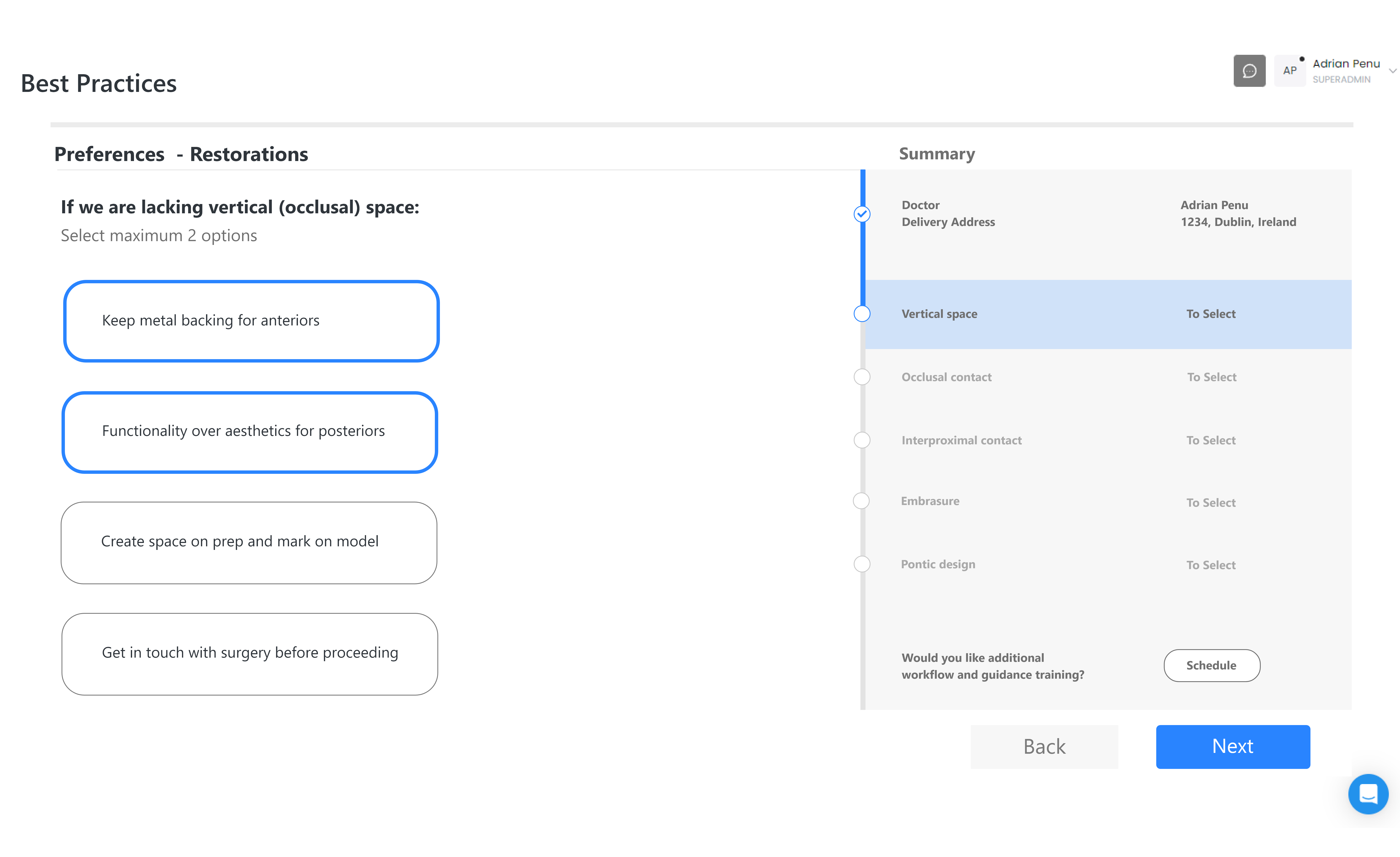
Vertical progress bar informing user about the current status of the task and the steps needed to completion.
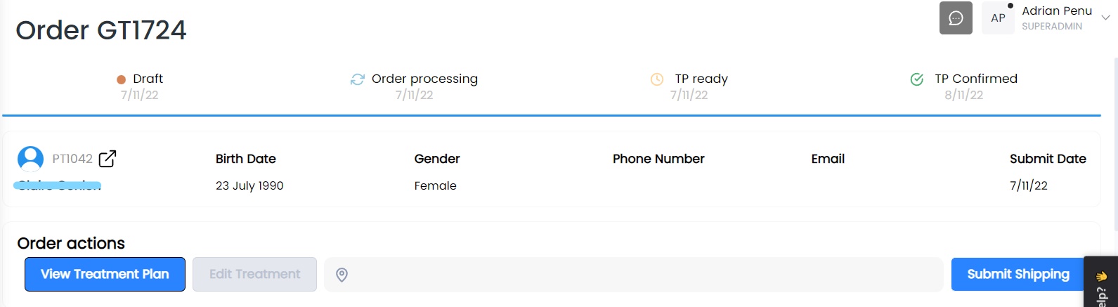
Horizontal progress bar for order tracking.
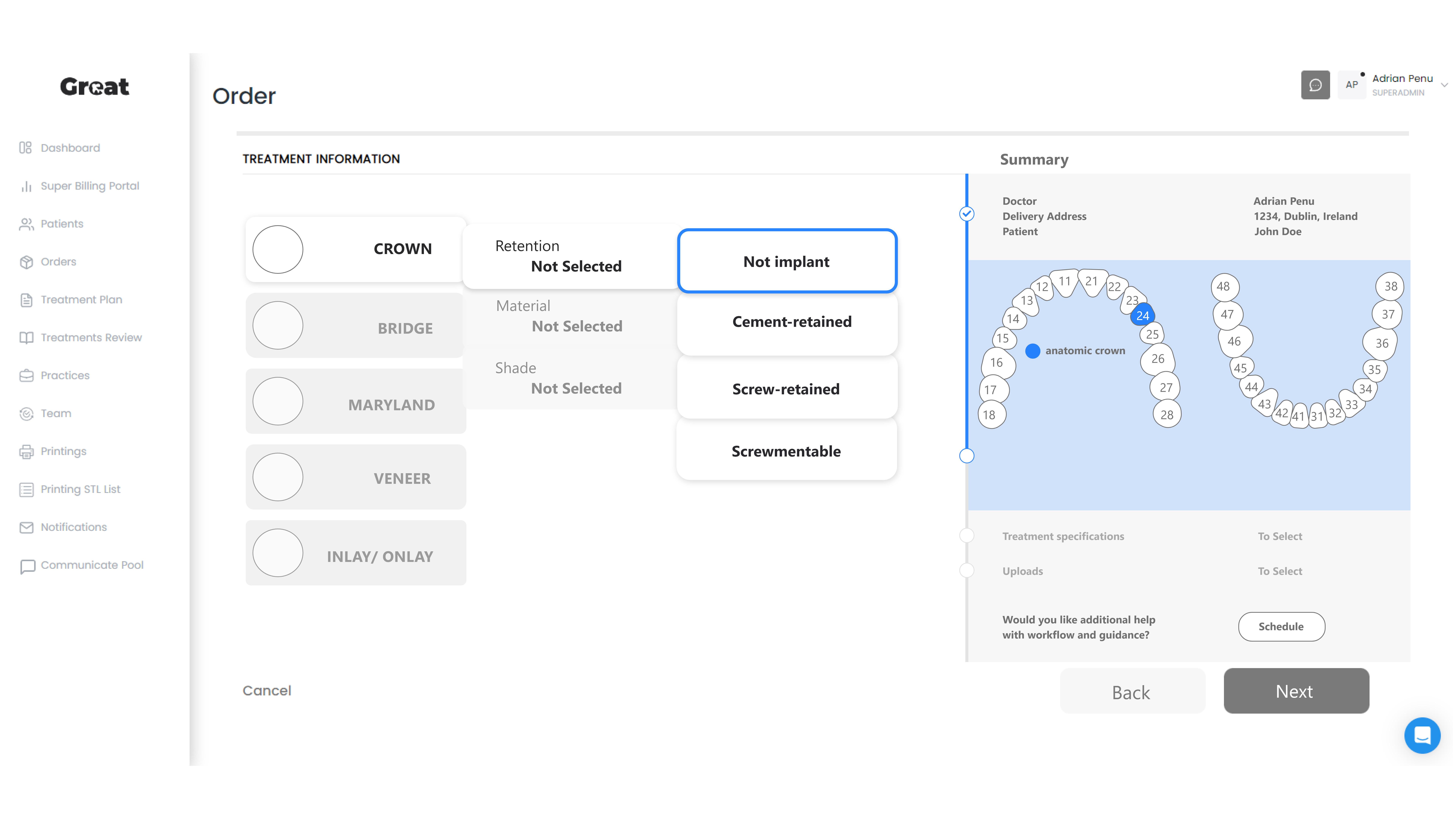
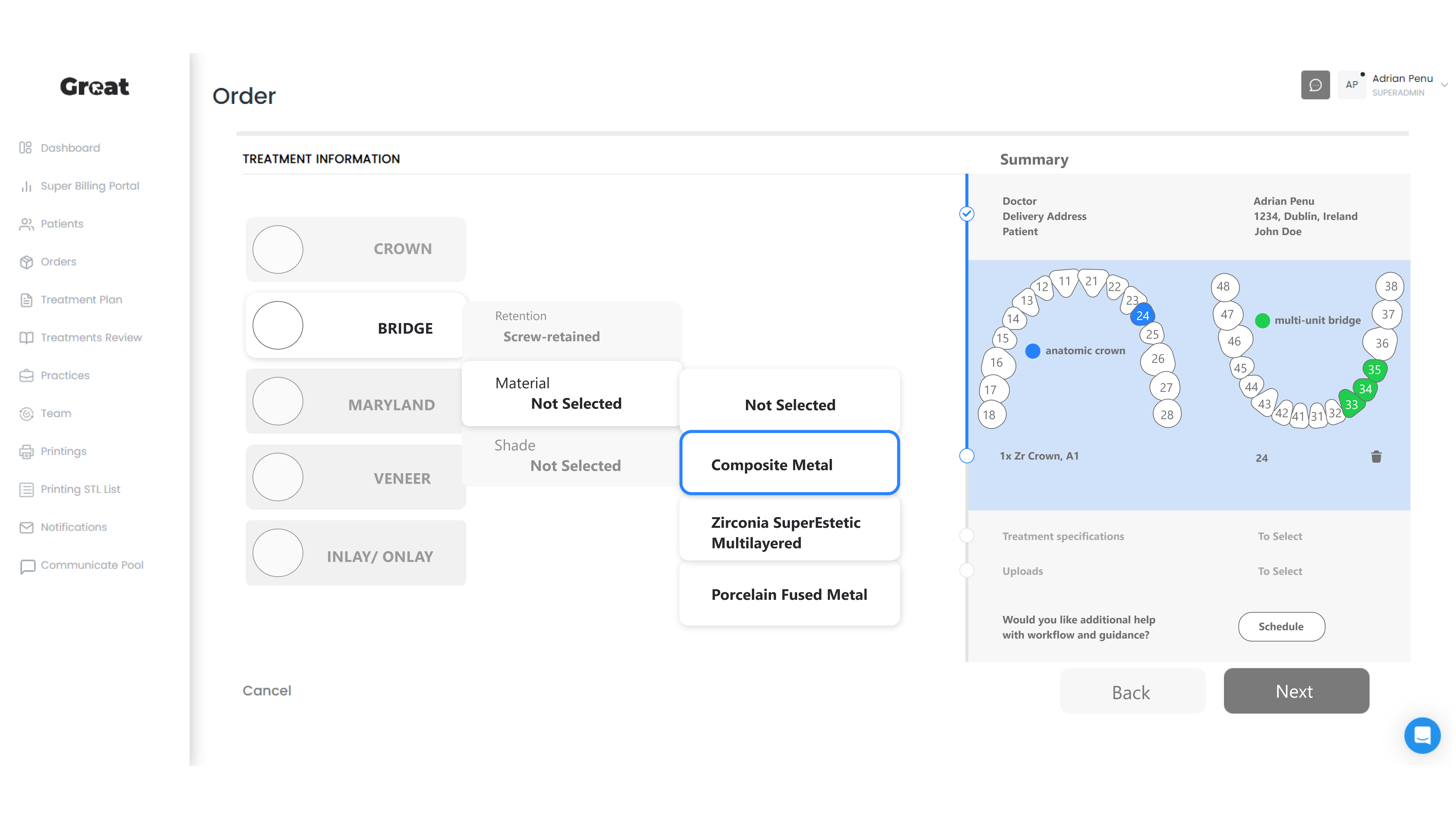
Another concern was to offer users the possibility to place different type of products within the same order. Currently the software allows dentists to checkout multiple products but only if they're the same type of restoration and made of the same material (ie. metal, zirconia, etc.).
"Dentists should be able to order crowns, bridges, implants or veneers for the same patient in one go. Similar versatility to a food delivery app."
Setting the design direction
Taking a top-down approach to defining the overall framework of the experience required higher emphasis on planning and understanding how the new features will affect the system as a whole.
I generated stacks of ideas about the arrangement of UI, functional and data elements, and interactive behaviours. Starting broad, our vision began evolving into something tangible. A high‐level design language, interactions and minimalistic composition began to piece together.
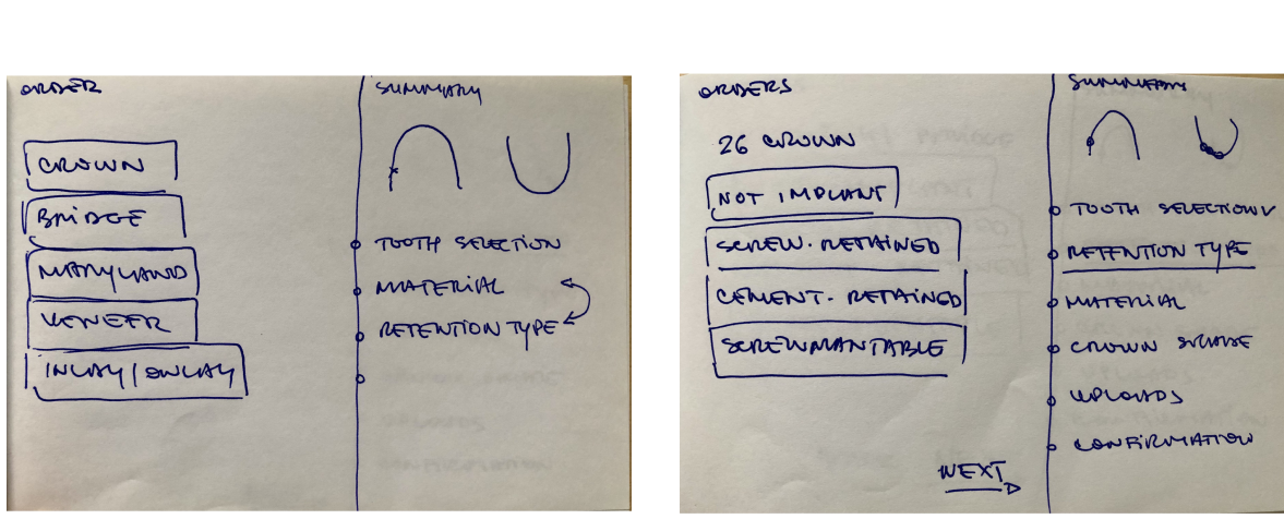
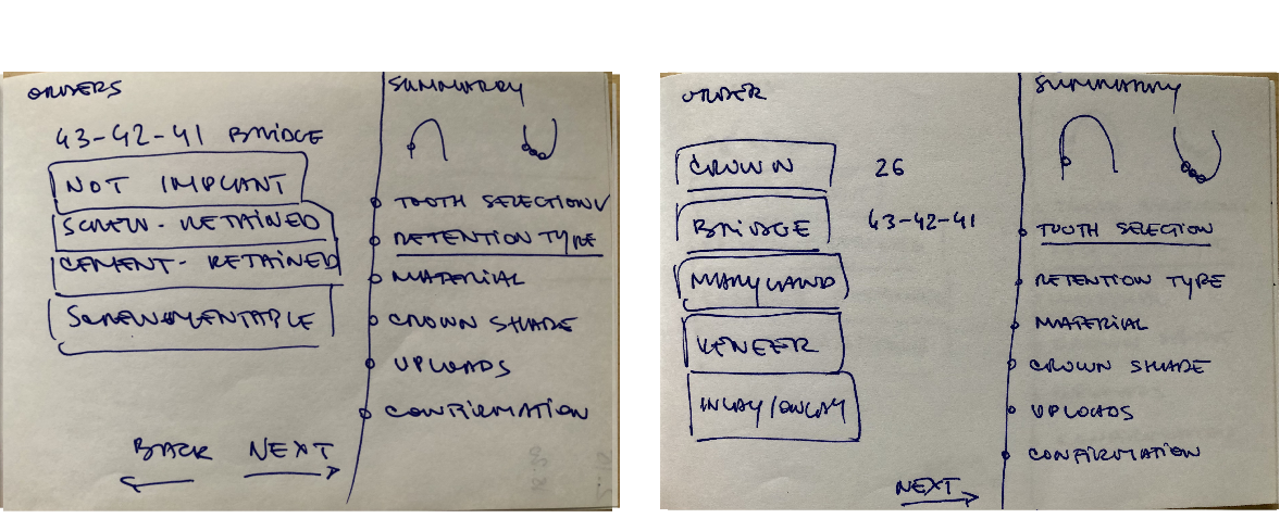
Early sketches exploring different navigation patterns for the order flow.
Because of time pressure, I worked rapidly often jumping straight from sketching to prototyping.
I've created site maps to share with stakeholders and engineers with the purpose of establishing a common understanding of how the ordering process will look like.
Before moving to the design stage the developers suggested to map out the ordering system in its entirety so they can see how everything will fit in together. Thus I continued the site mapping for implant and restorative systems.
"Working together with the engineers using an Agile methodology allowed for adaptive planning and better time management."
The next hurddle was to turn these highly technical road maps into user friendly layouts that increase efficiency and improve navigation. Creating the blueprint allowed us to find patterns that can help devise workable solutions around every single piece of functionalty.
The interaction experience
Understanding the usage contexts of the platform helped me develop a clear vision of the tonal expectations of our users. To communicate the personality of our app to our client and team, we developed a set of experience principles. These were used to sense‐check design decisions, articulate core values and describe key attributes the product should uphold for both the users and the brand. The principles were used constantly to drive the aesthetic, feel and overall tonal direction of the app.
Mid-fidelity wireframes for clear aligners order flow. Example of layout with progress bar integration and use of dental chart (right image).
For the crown & bridge order flow I've used collapsable menu customised for each product allowing dentists to adjust the experience for different requirements and minimizing cognitive load.
Mobile version
Constant communication between departments has been pivotal in maintaing the vision and tone of our product throughout the design process. The deliverables for the clear aligner orders have been sent to the UI designers to refine the interface by adhering to our design system library.
High-fidelity prototype ready for development.
We're planning to launch the new ordering flow for clear aligners to selected users first to gain feedback and fix any issues before fully going live.
INSIGHTS
Reflections
These changes have improved the quality of service and there has been an increase in orders in the final quarter of 2022. The product that was in place before I joined the team was unidimensional and rigid. By demanding high standards from ourselves and the work produced we want to create a culture that seeks to earn trust through accountability, attention to detail and continuous improvement.
The approach of the company is for incremental developement of the SaaS platform based on research and feasibility. Besides delivering high quality dental restorations the company has to equally focus on the digital product that it's offering to customers. This challenge is not something that traditional dental labs have to deal with and is revolutionising the industry.
What's next
Improving the navigation and interface elements are an ongoing process. We learn from feedback and usability testing so we can further reiterate and minimise frictions. Now that we have a solid framework to build upon we can focus on developing the restorative and implant based systems on the platform. A unified internal system for communication between technicians and dentists is also in the works.