Portfolio Website
As part of my qualification as a UX Designer I've chosen to specialise in web development.
This is the story of how I've applied front-end principles in building my UX portfolio site.
OVERVIEW
Summary
This project is meant to serve as proof of my competency in using tools such as html, CSS and JavaScript for creating a portfolio website. I’ve applied the design thinking process in order to build a page that will help me showcase my work and increase my chances of employability.
Context
Due to the abundance of choice when it comes to hiring UX Designers the need to stand out has become crucial. A well built website that showcases the work and the style of the designer is a must under these circumstances. I set out building it without any prior knowledge on how to write code.
The Challenge
The biggest challenge was to implement the new learnings about front end development by building a website from scratch.
Goal
Gaining competency in front-end development and creating a website that will help me in my career.
RESEARCH
Original like everyone else
High contrast, monochromatic, clean look with wide spaces is the visual approach of most top designers at the moment and it shows the obsession with minimalism in the West.
Anything ornamental or warm risks to be considered outdated or kitsch.For finding inspiration I dabbled with the idea of having a website where you can showcase not just your projects per se but also allowing visitors to catch a glimpse of who you are as a designer and person.
Achieving this through a strict and logical medium such as coding requires the developer to tap into artistic sensitivities and express them through styling and content.
THE PROCESS
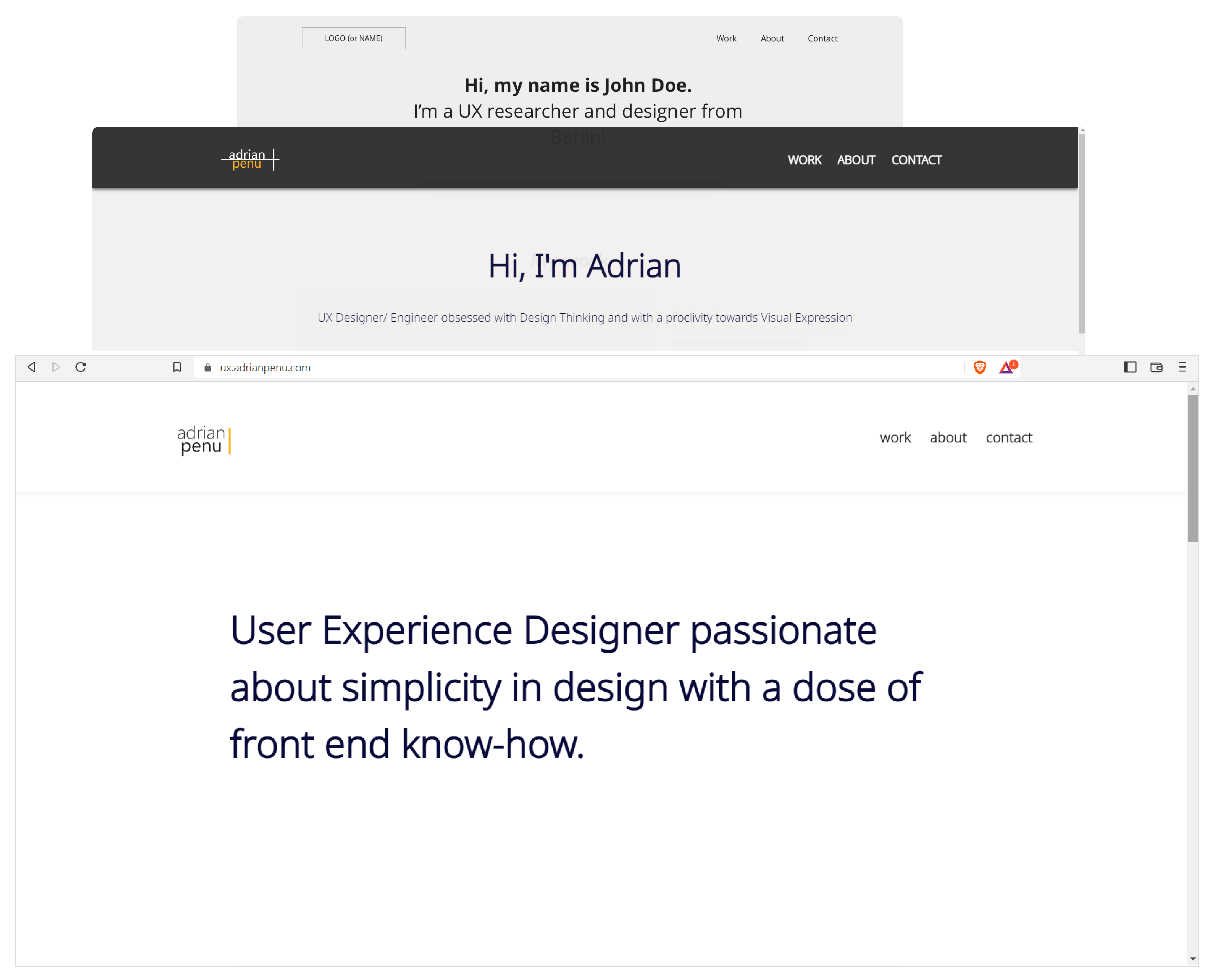
A UX approach
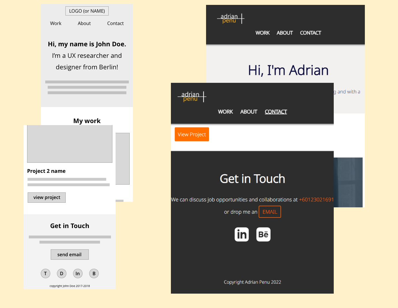
The template for building the website requires applying basic html concepts.
The result should be two column pages with multiple rows, a ‘hero’ section on the homepage and anchored to the footer the contact section.
Mistakes started appearing during CSS due to the cascading nature of value implementation.
Also I’ve got to learn about margins, paddings and the difference between them. Understanding these helped me create the layout and begin styling my website.
As a rule of thumb I start building the foundation with defining global classes first, followed by layout basics and finally specific features keeping similar elements together.
Adopting a mobile-first approach meant inspecting the result of my coding against a small resolution. Defining global classes to determine layout and styling, observing them in a one column composition helped build the foundation of the site.
Adding breakpoints in CSS with the use of media queries created a responsive design with progressive enhancement.
USABILITY TESTING
Less is more
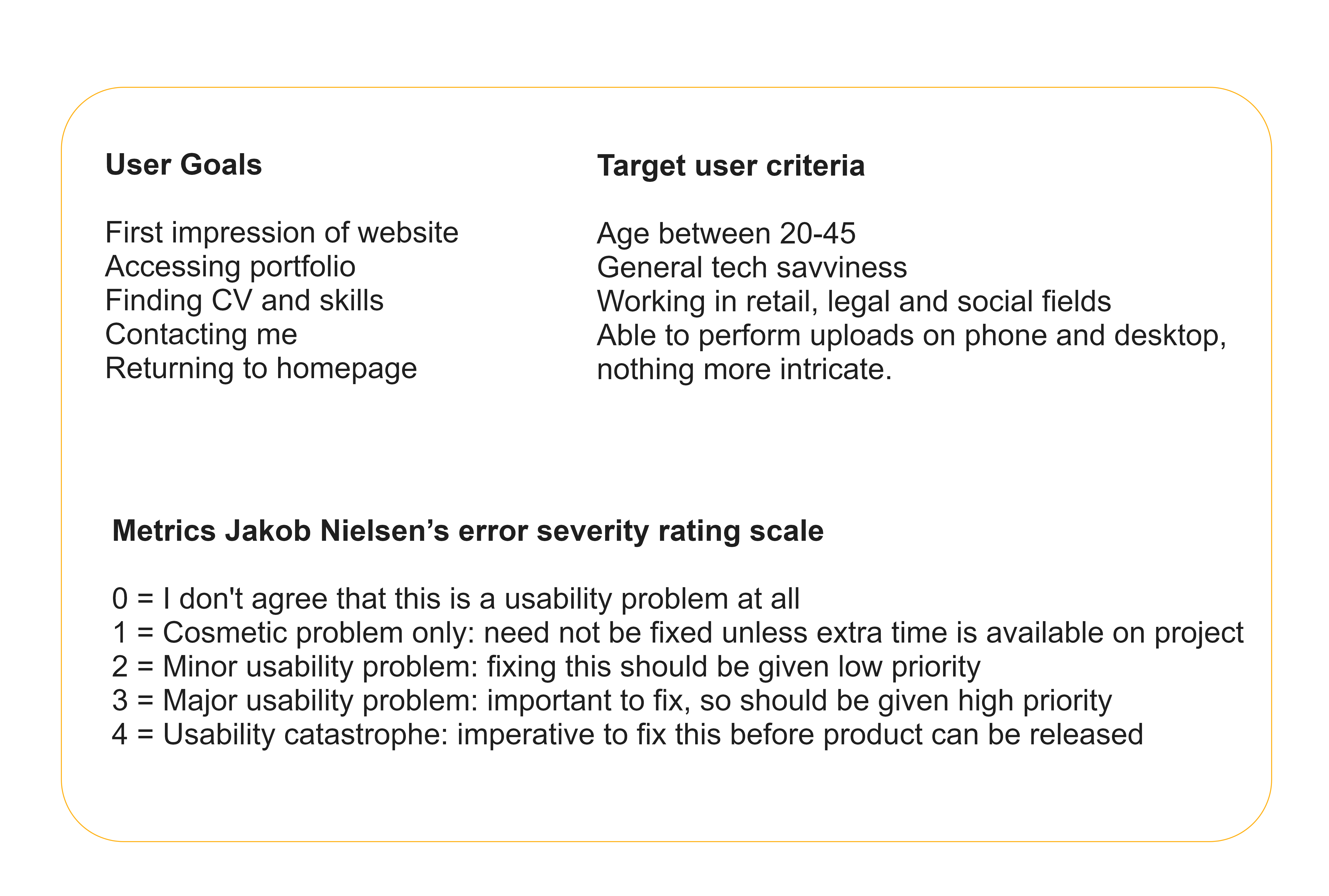
I’ve recruited 4 participants with different backgrounds and the characteristics of the target audience. They were given scenario based tasks to fulfill based on the user goals. The tests were moderated and recorded in person and remotely.
REFINING THE DESIGN
An ongoing process
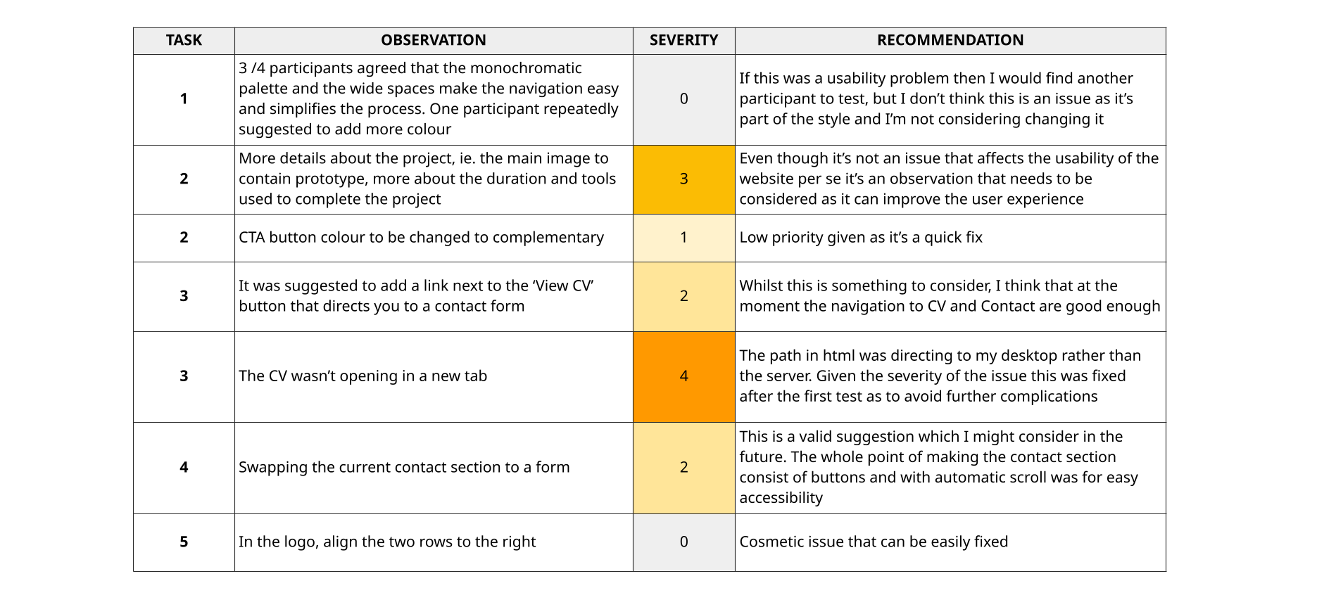
Usability testing helped me find answers to some of the major concerns regarding the design and general layout.
Intuitive navigation, cognitive load, accessibility and smooth transitions were considered when reiterating the design.
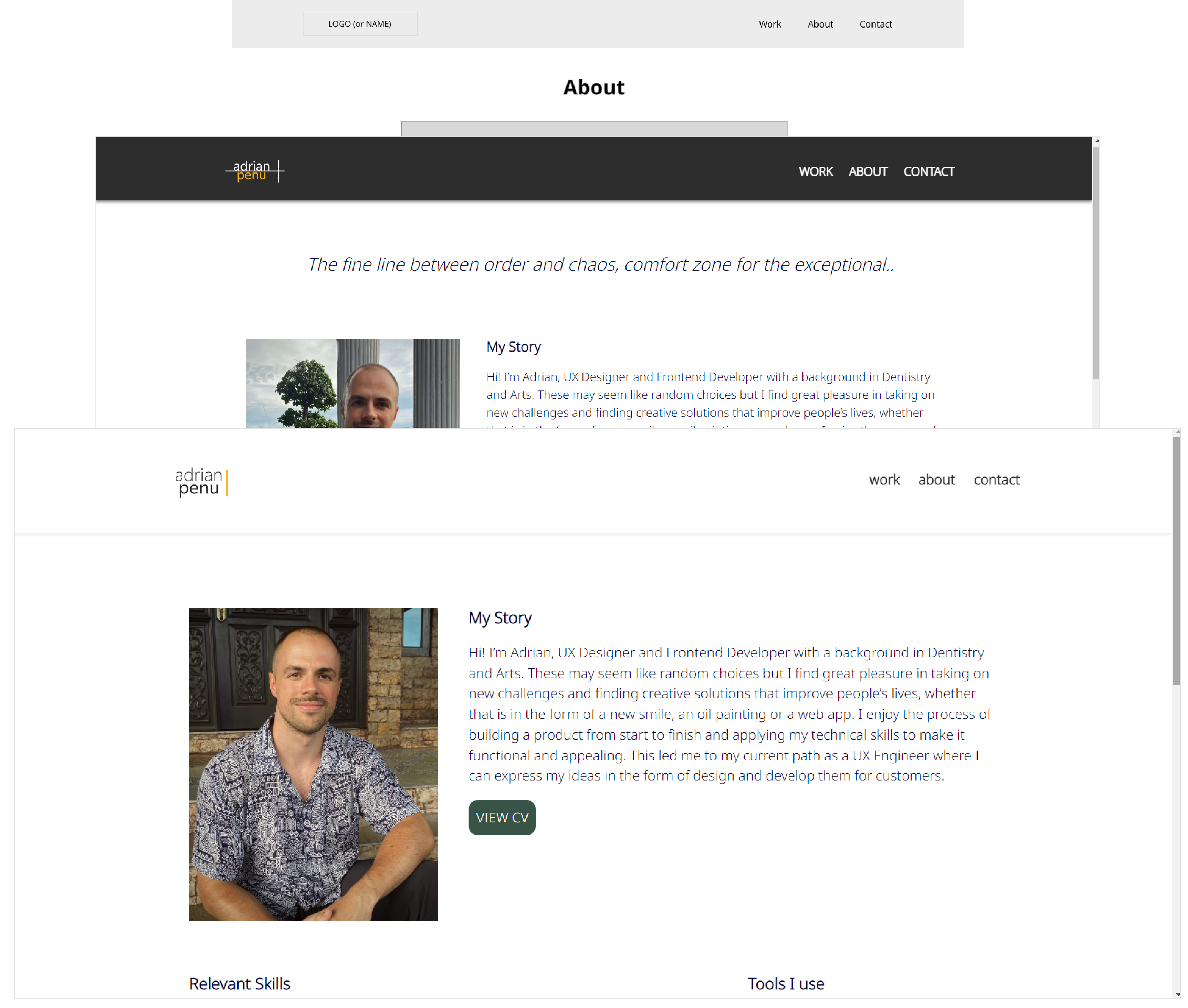
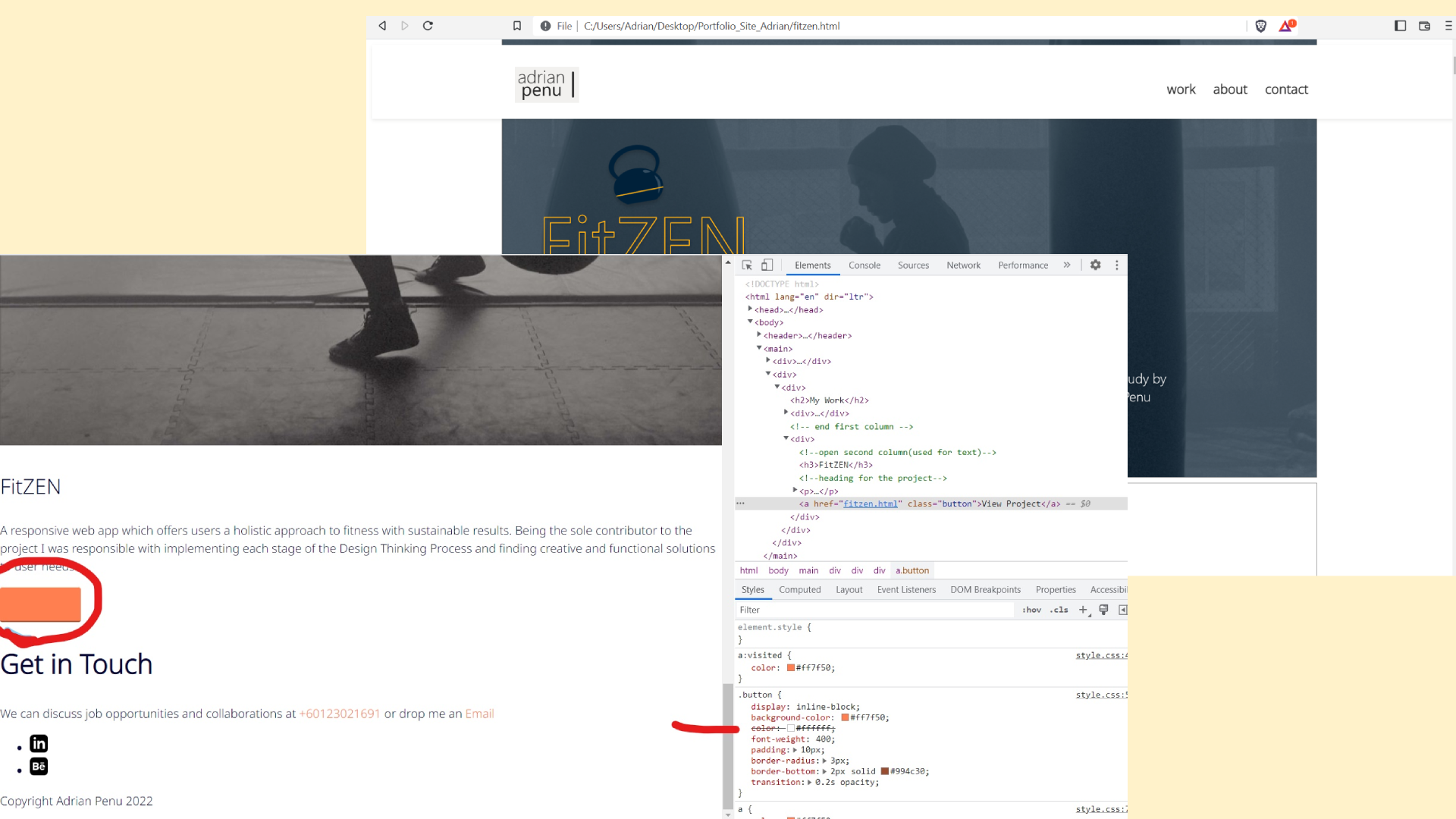
I tweaked the layout of the wireframes as I felt there was too much emphasis on the profile picture. I’ve also changed the dark colour of header and footer as it felt too constrictive. The CTA button background colour was changed to complement the light orange found in the logo and nav bar buttons in their hover state.
A new round of testing would be a viable option.
TESTING 123
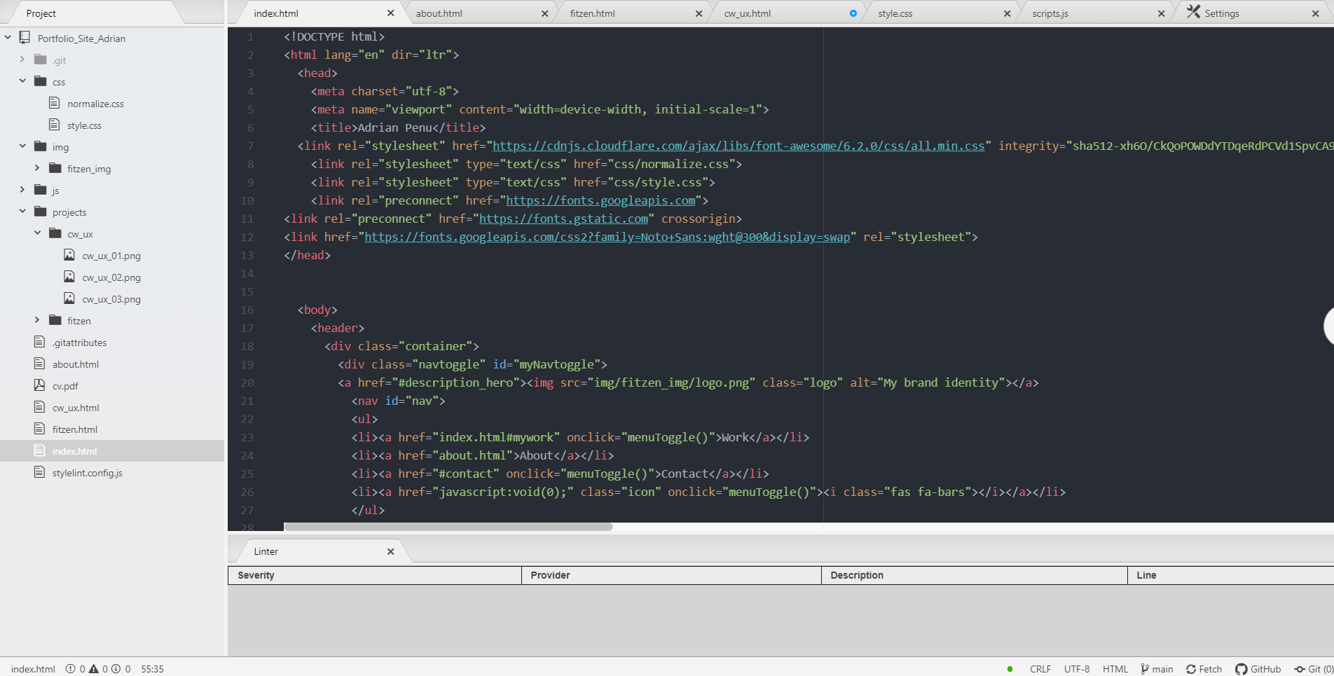
Debugging and browser testing
The linters downloaded and installed on Atom text editor are linter-htmlhint for the html files, linter-stylist for CSS and for JavaScript I’ve used jshint.com.
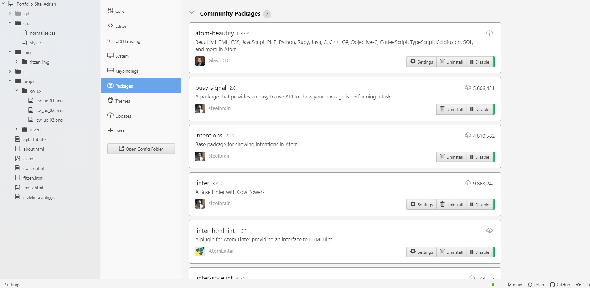
After successfully enabling the linters to work by passing the configuration I’ve noticed minor warning which the plugin couldn’t fix itself.
Adding missing 'div' and correcting the uppercase in ‘viewBox’ (svg files) was enough to have zero errors.
What I like about the plugin is that it will notify me about errors on all pages by highlighting them on the left nav bar.
"Once the code has been debugged I've followed up with cross-browser testing. I've used Brave as default browser which is known for blocking unwanted features and ads.
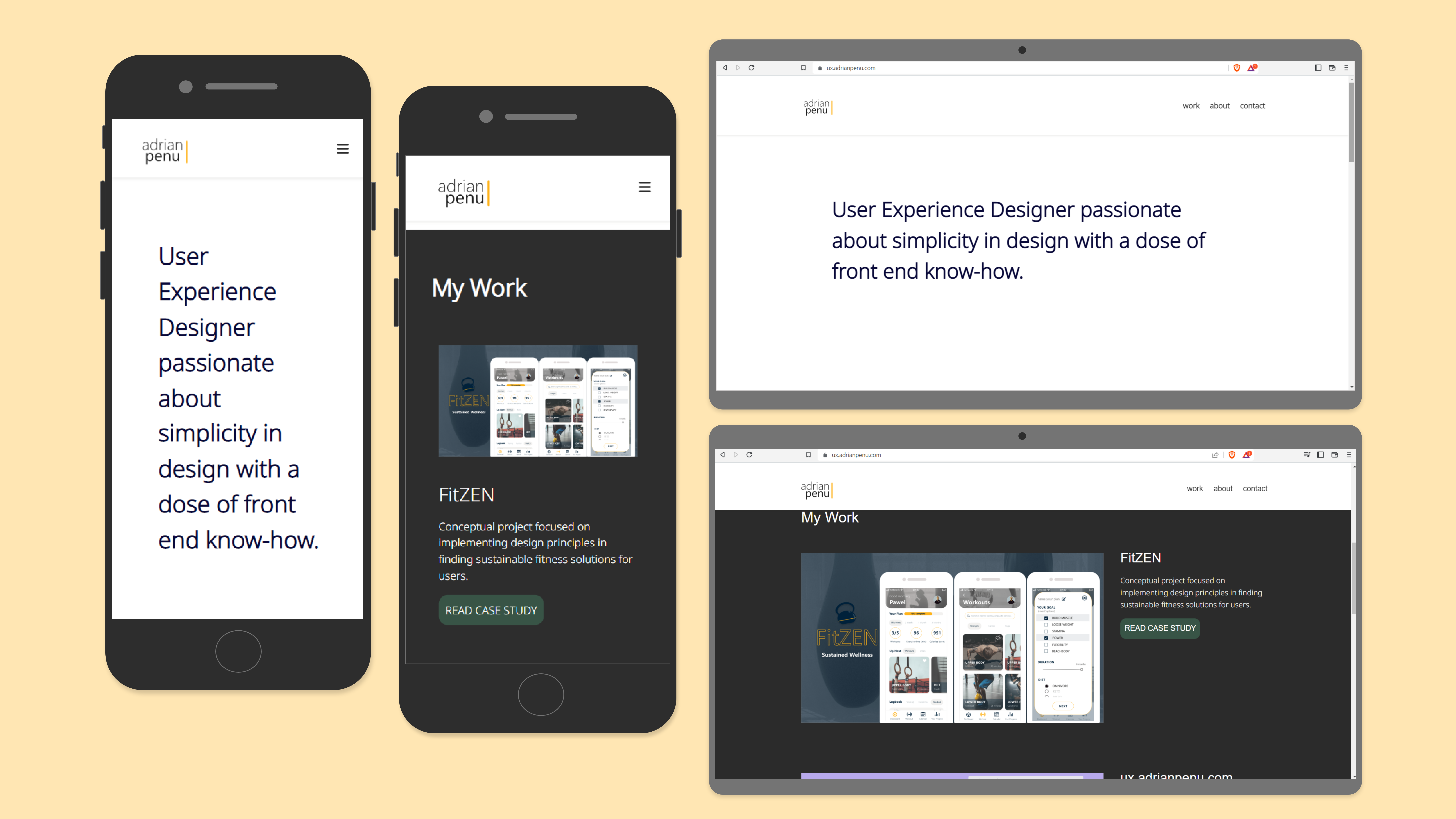
"The responsiveness and accesibility are flawless on other browsers such as Chrome, Mozilla and Safari. On mobile devices the nav bar is hidden under a hamburger menu.
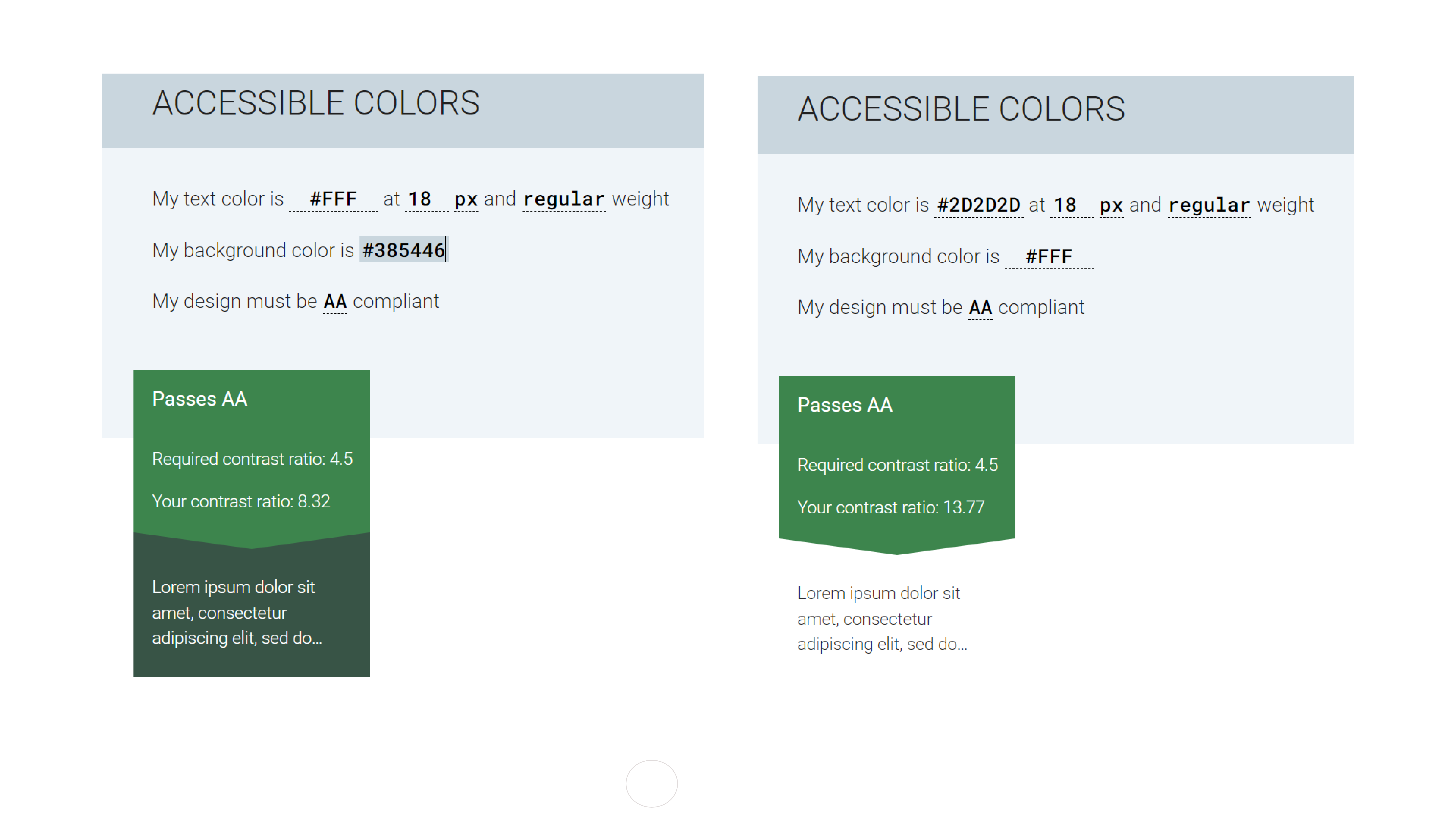
Colour check for accessibility
The features and buttons have constantly been checked during the development stage and then finally user tested.
Having a minimalist style regarding website composition and colour I had to only check the contrast of font and CTA buttons which both passed the test.
VISUAL DESIGN
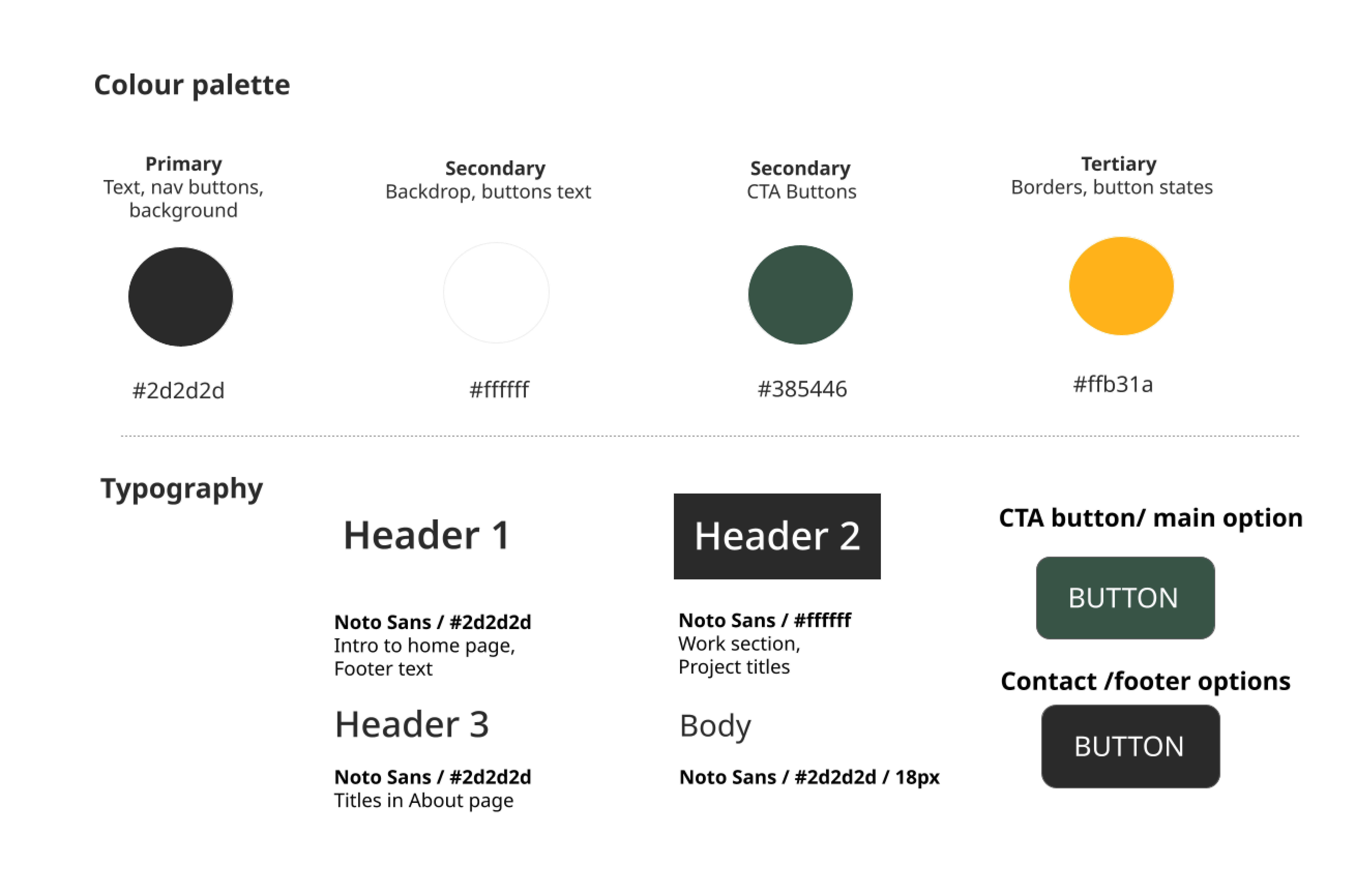
Component library
I’ve created a structured design system to maintain consistency on all screens.
A design language system makes it possible to ensure that the styling is cohesive and improves user experience.
CONCLUSION
Outcome
By building the website and laying the foundation of my ‘brand identity’ I have solved the first step of the problem statement. Only within a few months of launch will it be possible to tell if we’ve fully addressed our job networking concerns by the amount of traffic on the site.
Learnings
I’ve learned a copious amount of new information in a short space of time. What helped me remember all the front-end rules and functions was their implementation on the spot and being personally invested in creating my own website.
Whats's next?
I would like to delve deeper into JavaScript and make the website more interactive by adding animations, clickable prototypes and smoother transitions.