FitZEN
In 2021 I've decided to change careers from Dentistry to UX Design. Part of the learning curve involved end-to-end design of a reponsive web app.
This case study showcases the application of all design thinking steps in order to create a product that is meant to solve user issues in regards to fitness.
OVERVIEW
Summary
As part of the UX Designer bootcamp by CareerFoundry, I was responsible with creating an app that would meet the general criterias and feature requirements. Alongside having a full-time job, the entire UX process took 8 months and revolves around the idea of helping users approach fitness and wellbeing from a holistic perspective.
Context
With over 8000 fitness apps available on the market it can cause users to feel overwhelmed by the multitude of choice. With more fitness oriented people than ever it’s crucial to create a product that it’s based around their personality, expectations and desires. According to comparecamp.com the main challenge is to keep users committed and motivated to achieve their goals.
Hypothesis
By adopting a holistic approach to our wellness app, we believe it will help users achieve their goals and adopt a health-conscious mindset in order to maintain the results.
We expect to see an increase in engagements with the product and positive reviews.
The process
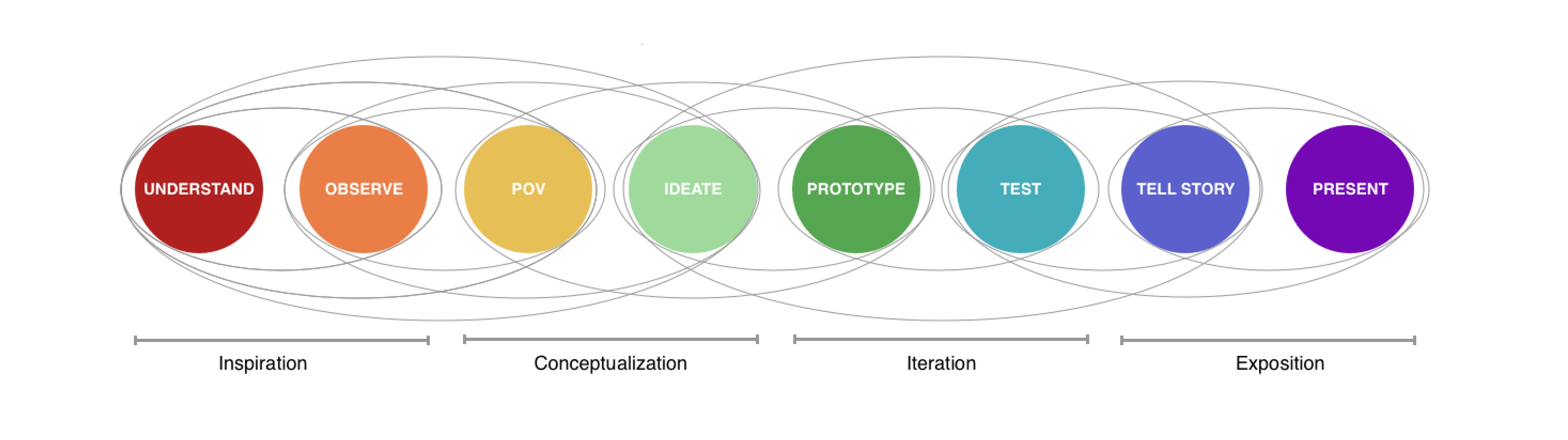
UNDERSTAND
Focusing on business users
Understanding user problems whilst also addressing the expectations of stakeholders and acknowledging the business scope are aspects to be taken in consideration when drawing up a plan to which all parties can adhere to.
Target audience
The mindset of our target user is someone who understands the need for physical and mental improvement but is not sure where and how to start the journey. Another type of user could be someone who is already working on their well-being but would like to track their progress, access medical history or want to experiment with a new program.
Risk & opportunity
The main risk is that our service will not gain enough traction to stand out from the plethora of wellness apps that are currently available. .
We can make the difference by creating an app that will guide and inform the user on the necessity of overall improvement in order to achieve maximum results.
Competition
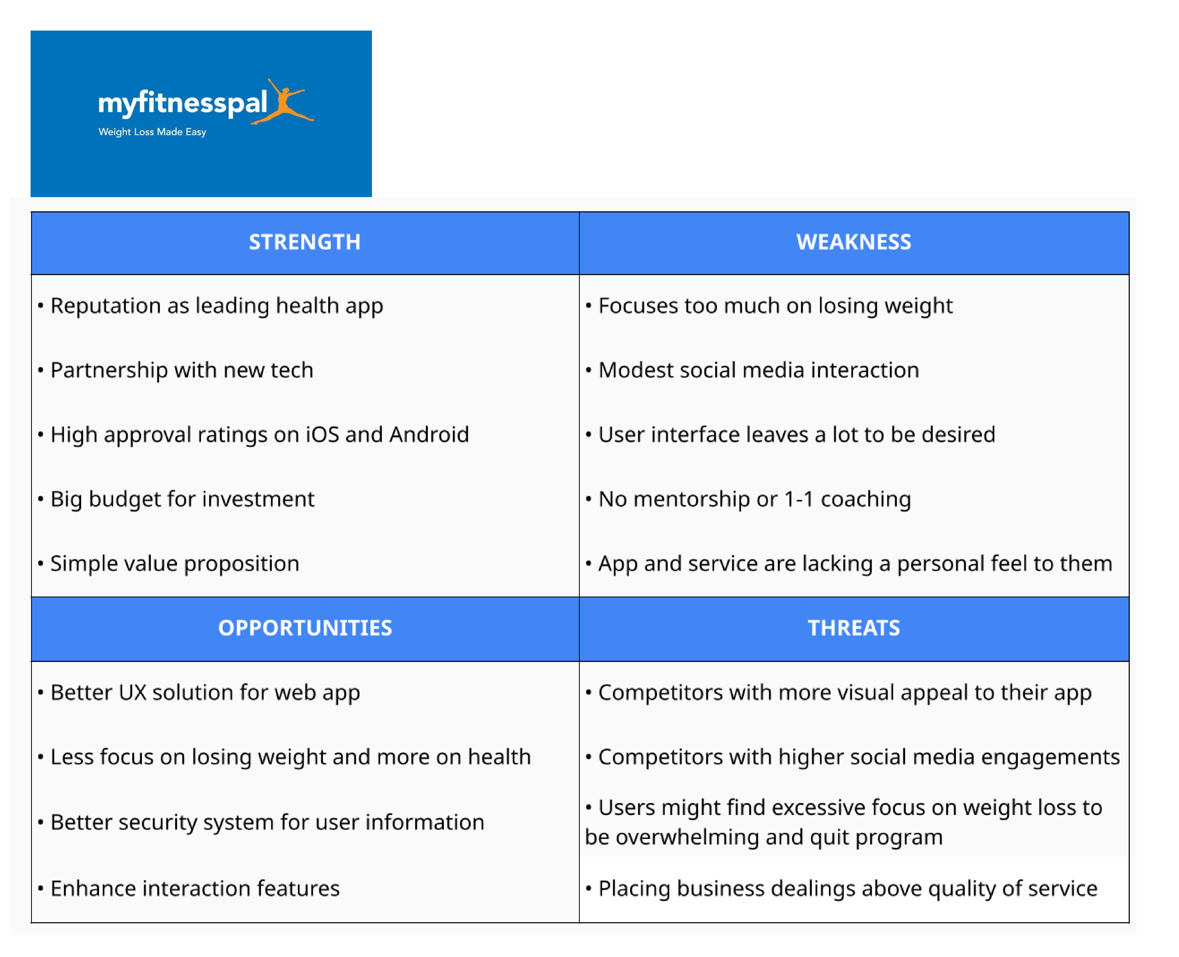
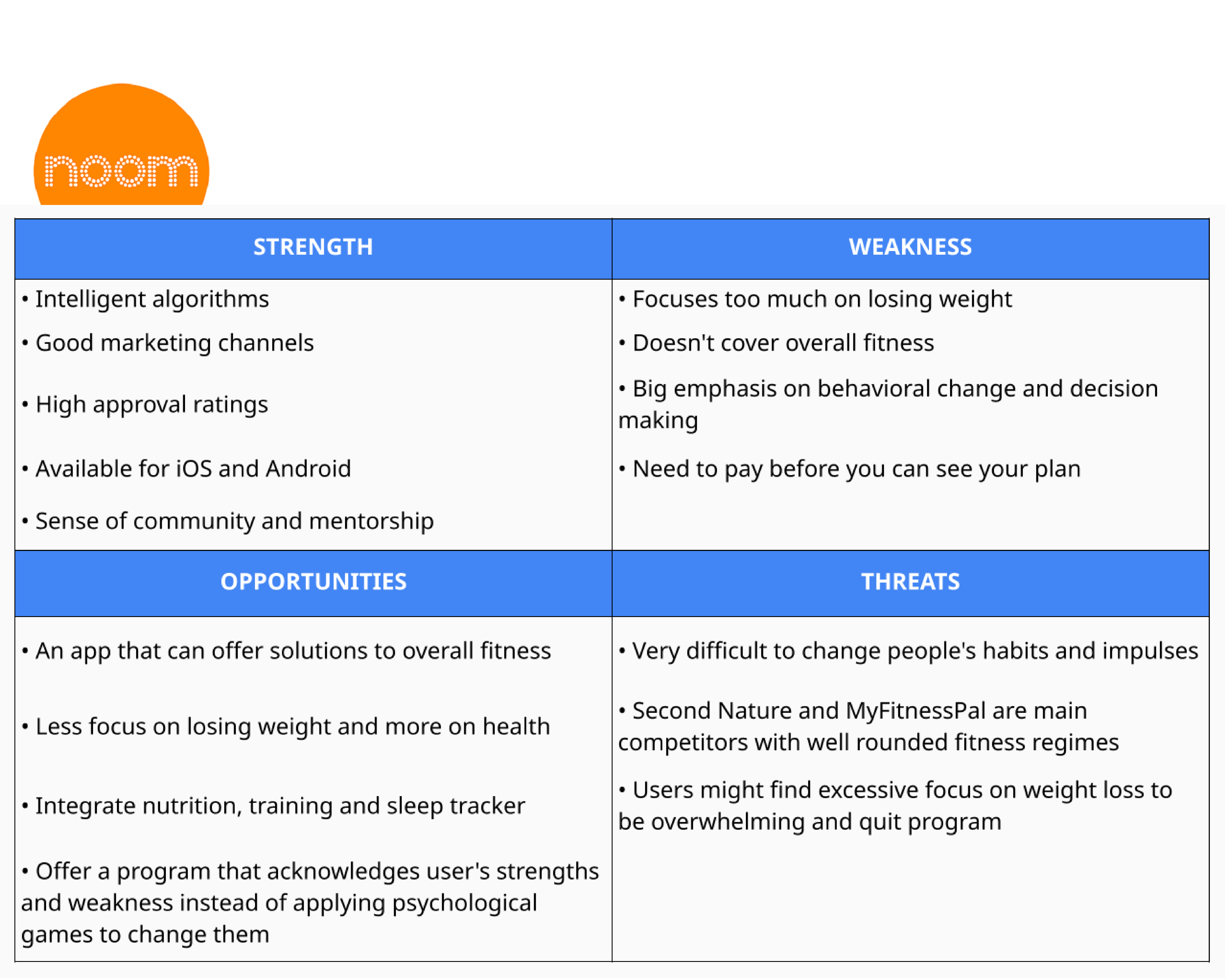
Main competitors to our service would be the likes of Noom and MyFitnessPal. This is due to similar approach of helping the clients feel better and get in shape by tracking their diets and exercise routine.
Problem statement
Health-conscious people need a way to start their journey in fitness and stay on track with their well-being because it can be very difficult to find time and motivation in everyday life.
We will know this to be true when we see users reaching their health goals.
COMPETITIVE ANALYSIS
Swot analysis
OBSERVE
Research goals
Understand user perspective on health through their experiences and habits.
Investigate user needs and motivations regarding their wellness.
Determine what features are desired in an app that would facilitate user’s health journey.
"I started the research by doing surveys to get a general understanding of the direction of my project followed by user interviews for the second stage of the research process.
Research insights
Survey
23 participants took the survey
Under personality type 34.8% describe themselves as procrastinators
Overwhelmingly, 87% consider themselves as moderate eaters
78% use their phones before going to bed and 61% wake up feeling tired or anxious
As to what has the most impact on overall health, the responses are mixed, 34% considering mental health as key factor
Progress tracker was voted to be the most desired feature in a fitness app.
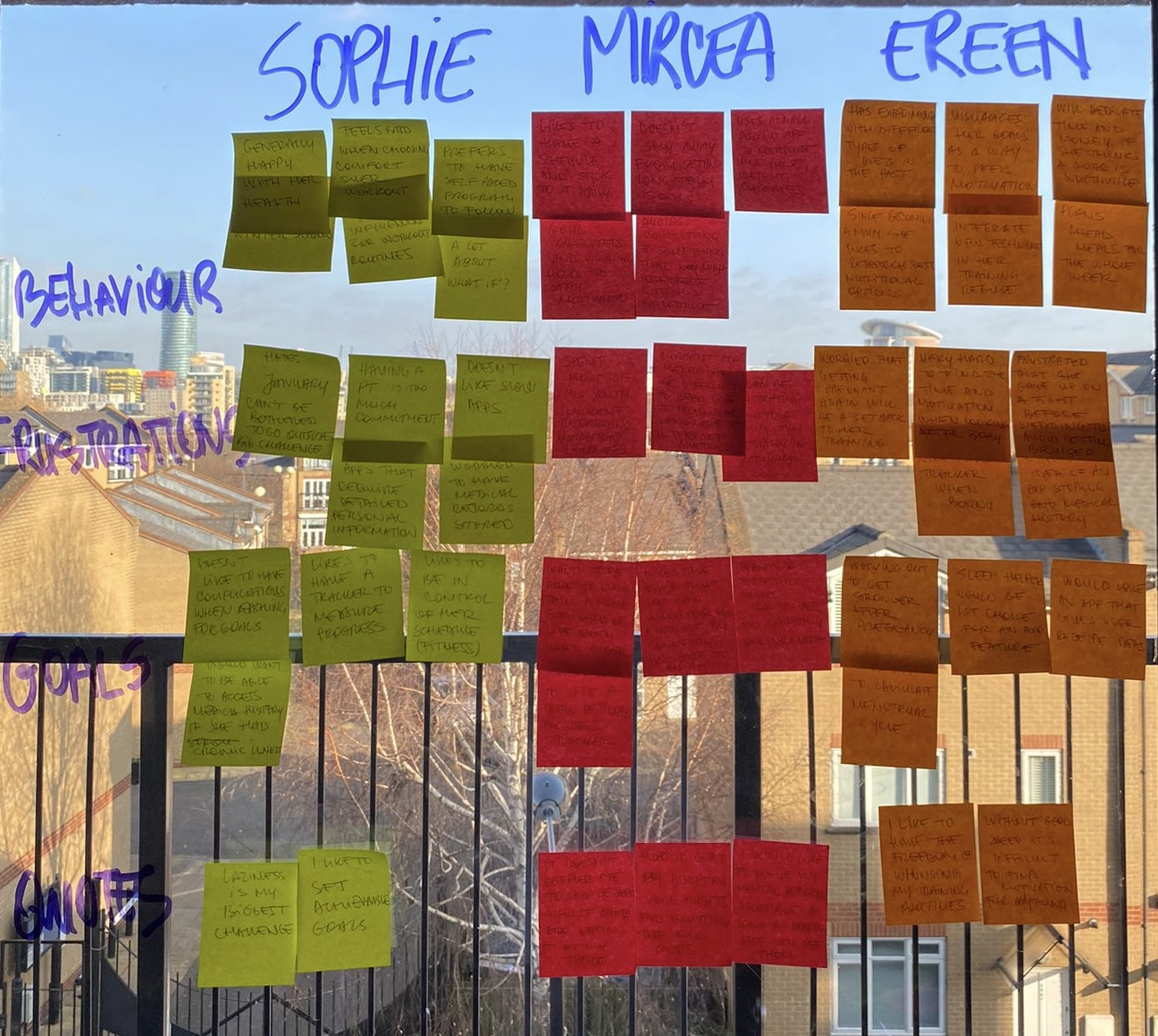
Interviews
3 participants (2 in-person, 1 remote), ages 30-34
Take proactive measures to improve their quality of lives on a daily basis
Each of the interviewees engages in different types of activity: yoga, cycling and martial arts
2/3 of the participants started documenting their workouts in the last 2 years
Self-paced programs seem to be preferable as they do not require a high level of commitment
View full list
Finally I’ve used affinity mapping to help me organise the information based on correlation and relevance."
Possible solutions
Following this stage of research, I came across themes and concerns that are personal to the participants and would need addressing in our app.
Progress tracker that would raise the competitive levels and engage the user.
Customised training regime based on their goals.
Storing medical data received with skepticism.
Recommending healthy, fun and easy meals.
"During research I've also noticed the intensity of exercise increases when there's competition involved. This can be added to the app in the form of gamification or organise meetups with other users through a community hub."
POV
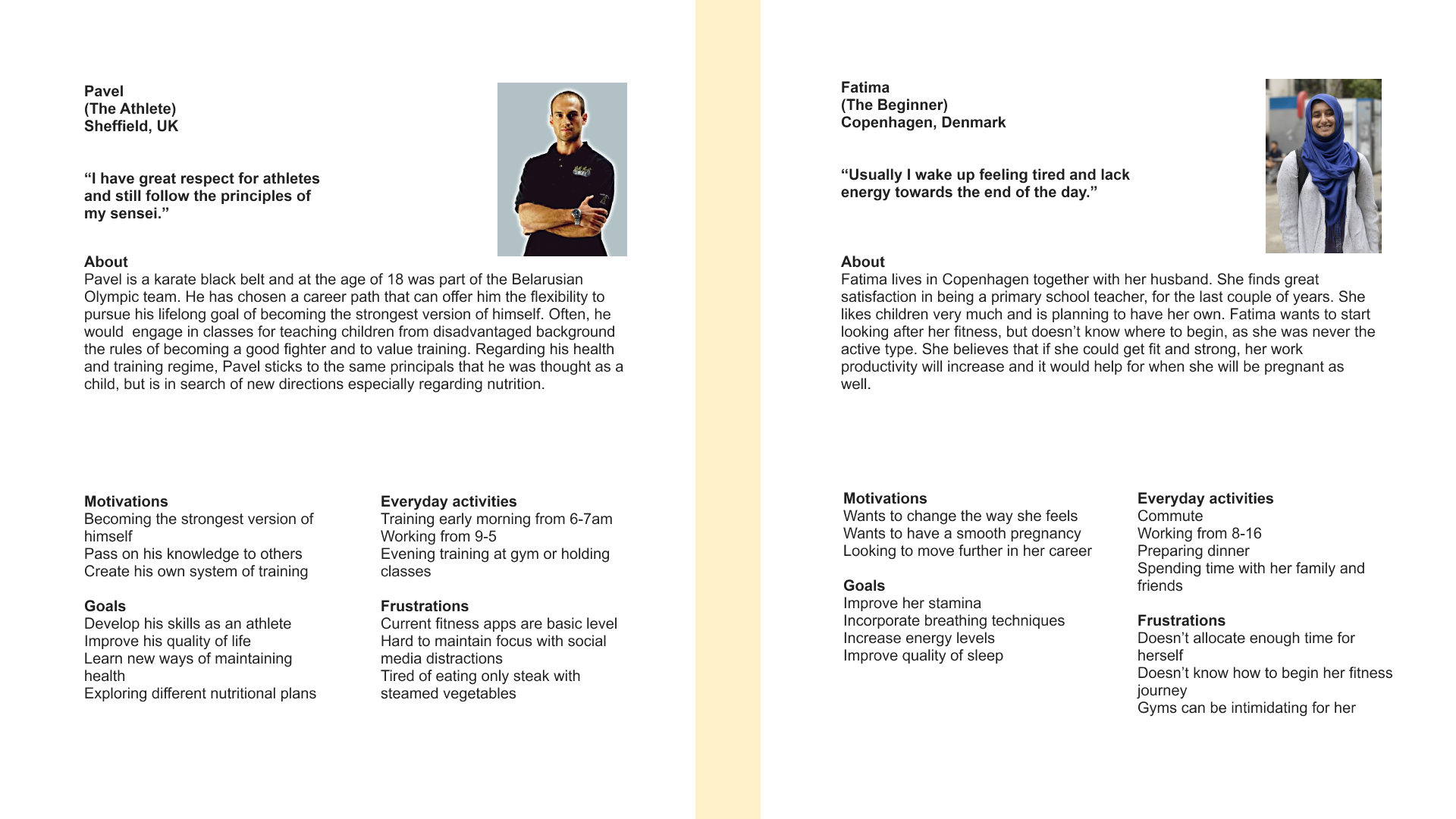
Personas
I’ve created personas with the purpose of making the research more relatable and building empathy with the user. They're not meant to represent the ideal user but rather the average user whom the app is intended for.
The two personas created for this project highlight different target audiences and their pain points.
Pawel wants to take fitness to the next level whilst Fatima is looking to improve the quality of life but doesn’t know where to start.
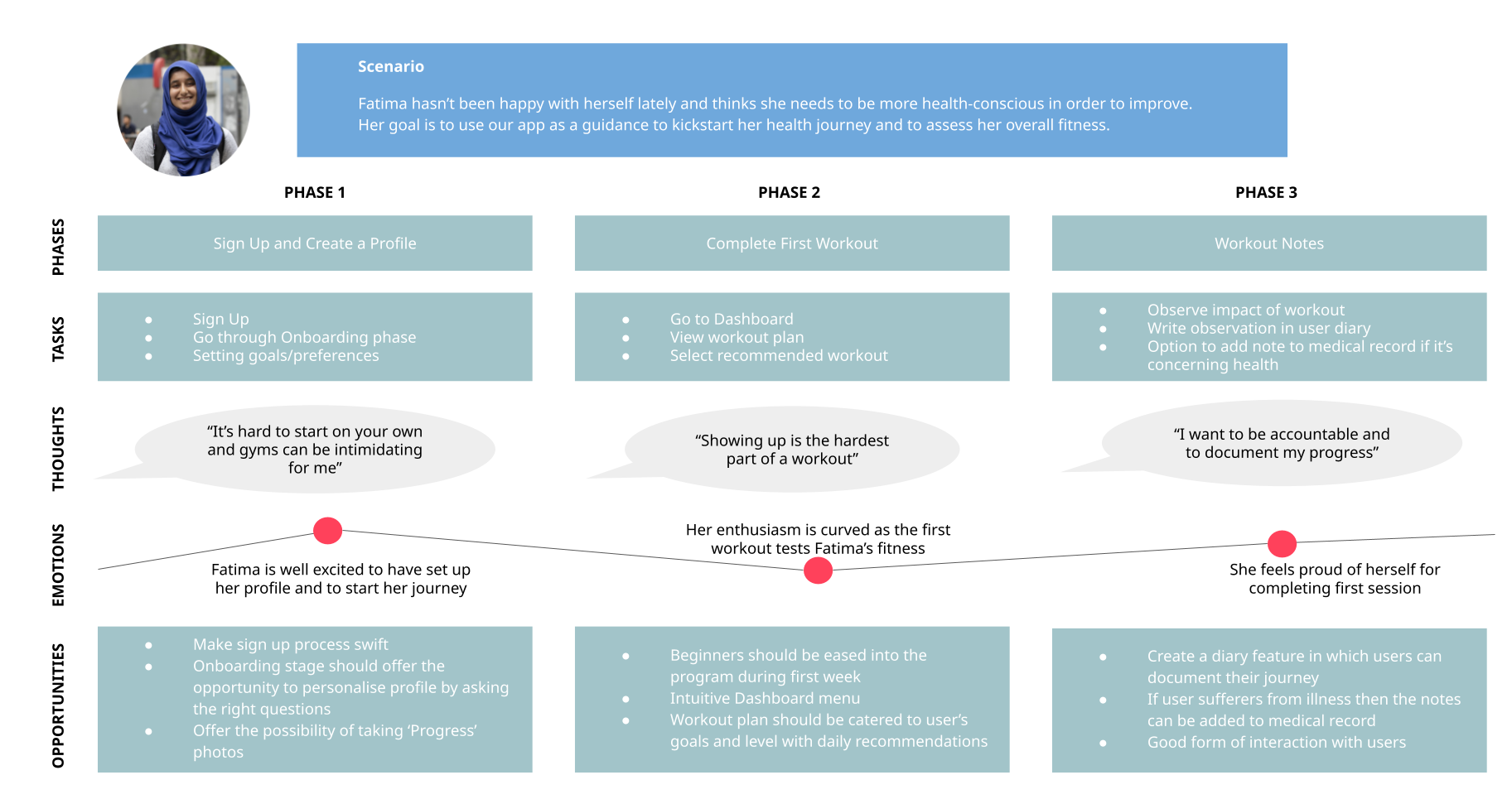
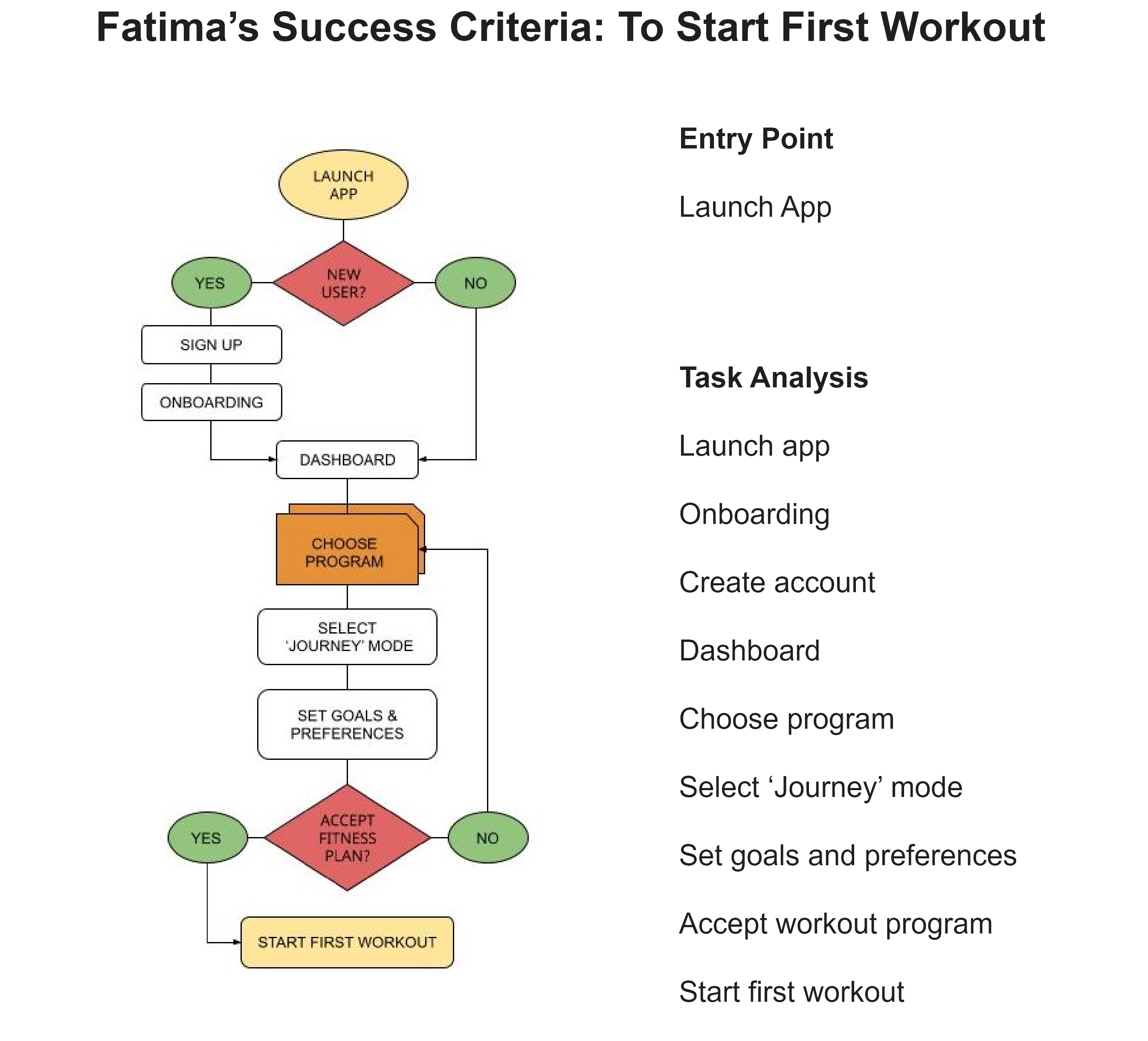
Fatima's user journey
IDEATION
Finding patterns
I’ve created Fatima's user flows as a basic task such as starting a workout. This helped me make sure the navigation remains simple and intuitive.
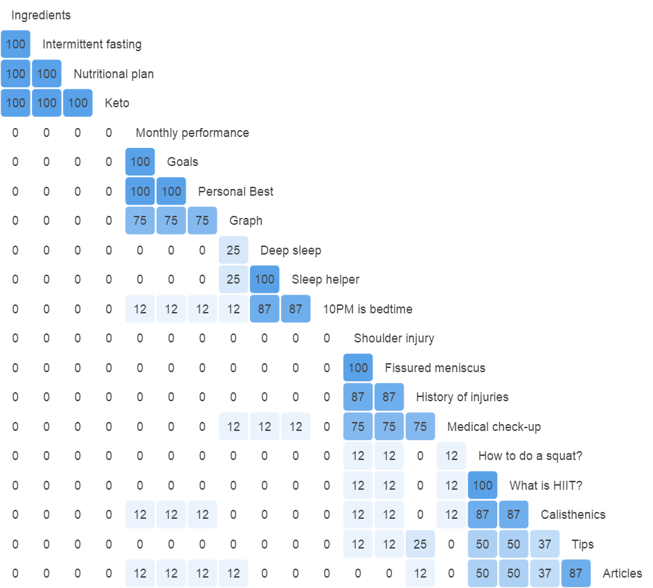
Card sorting
An open card sorting exercise has been conducted with 8 participants categorizing 20 cards based on their familiarity and relevance. The participants didn’t have any knowledge about the app and its features prior to this.
The highest consensus was with the category relevant to nutrition and diet. All the participants accurately identified the correlations on this topic. This reflects the concept in the initial sitemap.
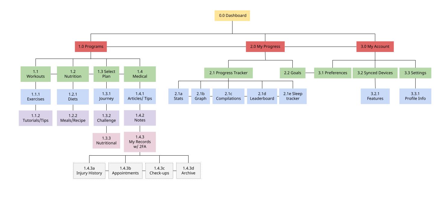
Site map
ITERATION
Wireframes and prototyping
Using pen and paper, I’ve created low fidelity wireframes to find the best solutions for navigation and layout. This method offers the creativity and freedom of experimenting with different approaches without investing too much time and resources.
The best layouts have been upgraded to mid fidelity stage using Adobe XD. An interactive prototype has been created with usability testing in mind.
User testing
Methodology
The tests will be moderated in person and remotely. Participants will use their own devices for engaging with the prototype. Sessions will be recorded through screen and audio recordings for analysis material.
Goals
The goal of the test is to asses the learnability of new users interacting with the prototype of the app. The test will consist of accomplishing simple core tasks such as logging in and creating a plan. We will measure the success rate and make decisions regarding design and functionality based on that.
Objectives
Observing how users navigate through the core functionality of the app and assessing the metrics involved to achieve the goals
Determining whether the app’s features fulfill the requirements of a fitness app
Gathering user feedback
Rainbow sheet
The rainbow sheet consists of a spreadsheet document where I've recorded behavioral patterns presented by research participants. Every time a participant exhibits a new note-worthy behavior I've written down the observation in the left-most column of the rainbow sheet.
Towards the right of the observations, each participant is assigned a color, and a label. If a participant performs a recorded behavior (or observation), the participants cell is filled in with the participant’s assigned color.
Key findings
High Severity : Clicked Settings button for medical records
High Severity : Difference between Workout and Plan was not clear
High Severity : Not clear what adding notes and calendar features are about
View full usability report
STORYTELLING
Refining the design
Usability testing helped me a lot in finding answers to some of the major concerns I had for the design and general layout. For example the categorization of workouts, intuitive navigation bar and improved forms layout have contributed in creating a much simpler and user oriented product.
Also the study of Material Design Components helped me make the app in line with the requirements of the field and adhere to universal principles of design.
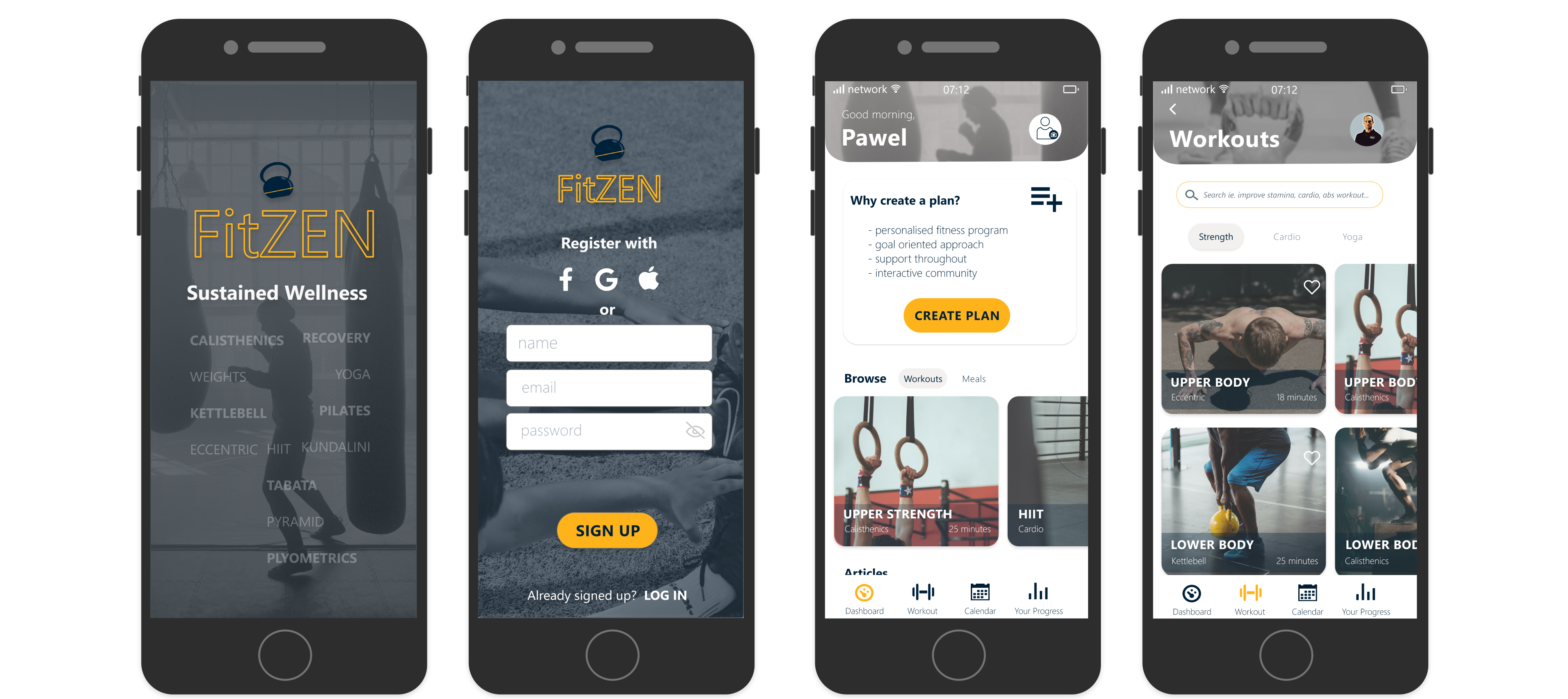
I wanted the onboarding process to familiarise and inform user about the content of the app and its functionality in the swiftest manner. Reducing cognitive load was a major factor in designing this features therefore the first onboarding consist of three pages each containing a simple paragraph describing the app.
Choosing background images was the main struggle because of the contrast with the text so I have moved some of the information into the splash screen. I’ve also relied on A/B testing for the logo.
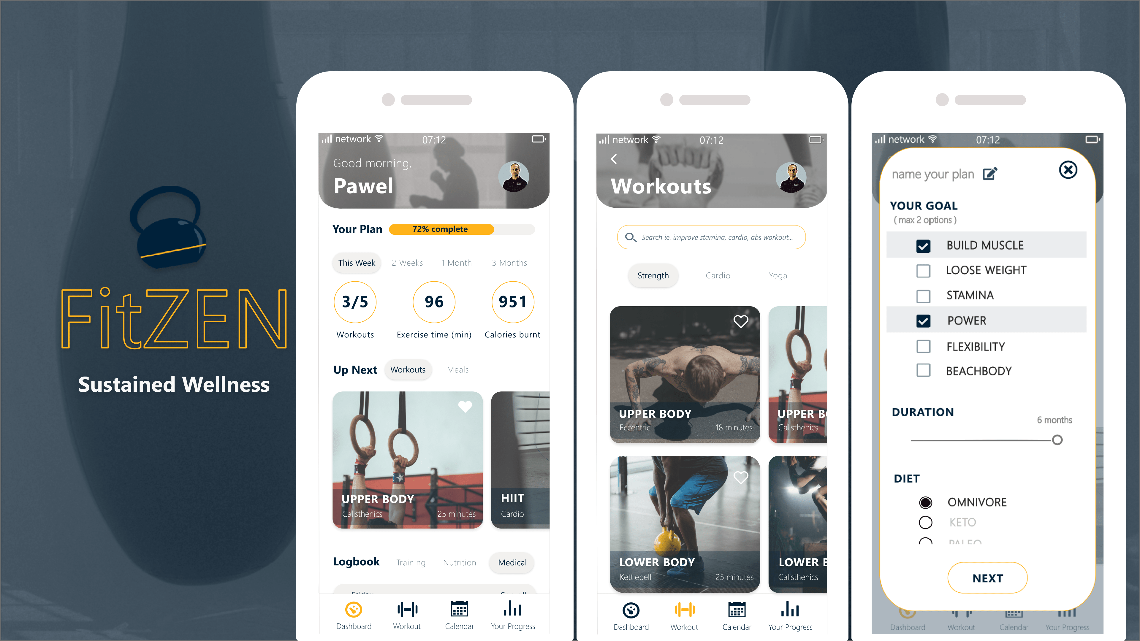
‘Dashboard’ screen is the main page of the app considered as a hub for the user. The idea was to design this page so it contains all the basic elements and keeps user engaged at the same time. In first instance I approached this issue by creating an interface consisting of cards with a vertical scroll. The feedback from user testing helped me understand the limitations and frictions that needed to be addressed.
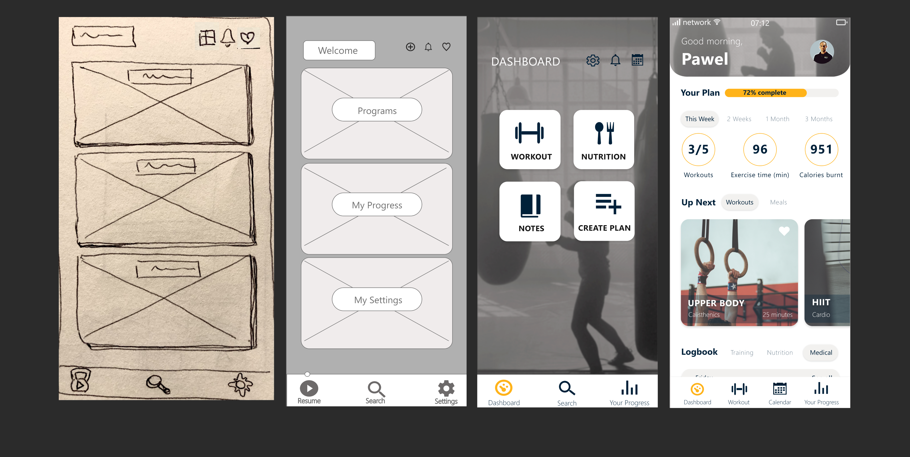
In the end I’ve chosen a more personalised interface where user can keep track of progress and navigate easily to other features. White spaces have been used to make the content stand out more and navigation bar has been redesigned for improved accessibility.
‘Workouts’ will most likely be one of the more popular features amongst users. Simplicity and clarity were my main concerns in establishing concise content. Initially, cards with icons were selected for workout categories but decided in the end to use a more user friendly approach by adding relevant images to the cards.
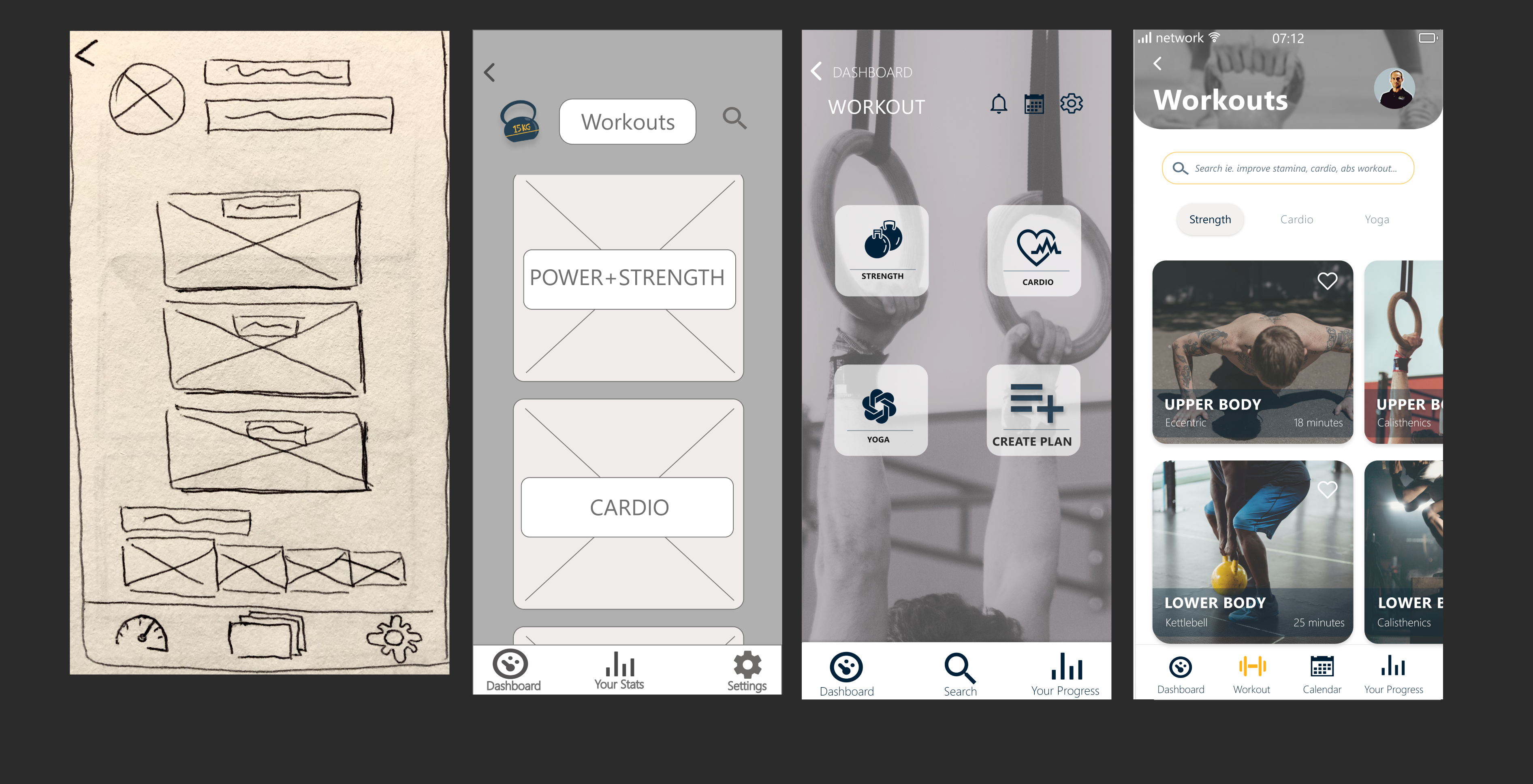
Following user testing I’ve decided to iterate a new version where the workouts are categorised by goals (ie. targeted muscle group) rather than type of exercise.
Finding a suitable way of gathering information from users which can help them achieve their goals is done by creating a personalised fitness program. The form was initially a one page pop up which contained horizontal scroll , drag and drop and checkboxes for selecting preferences.
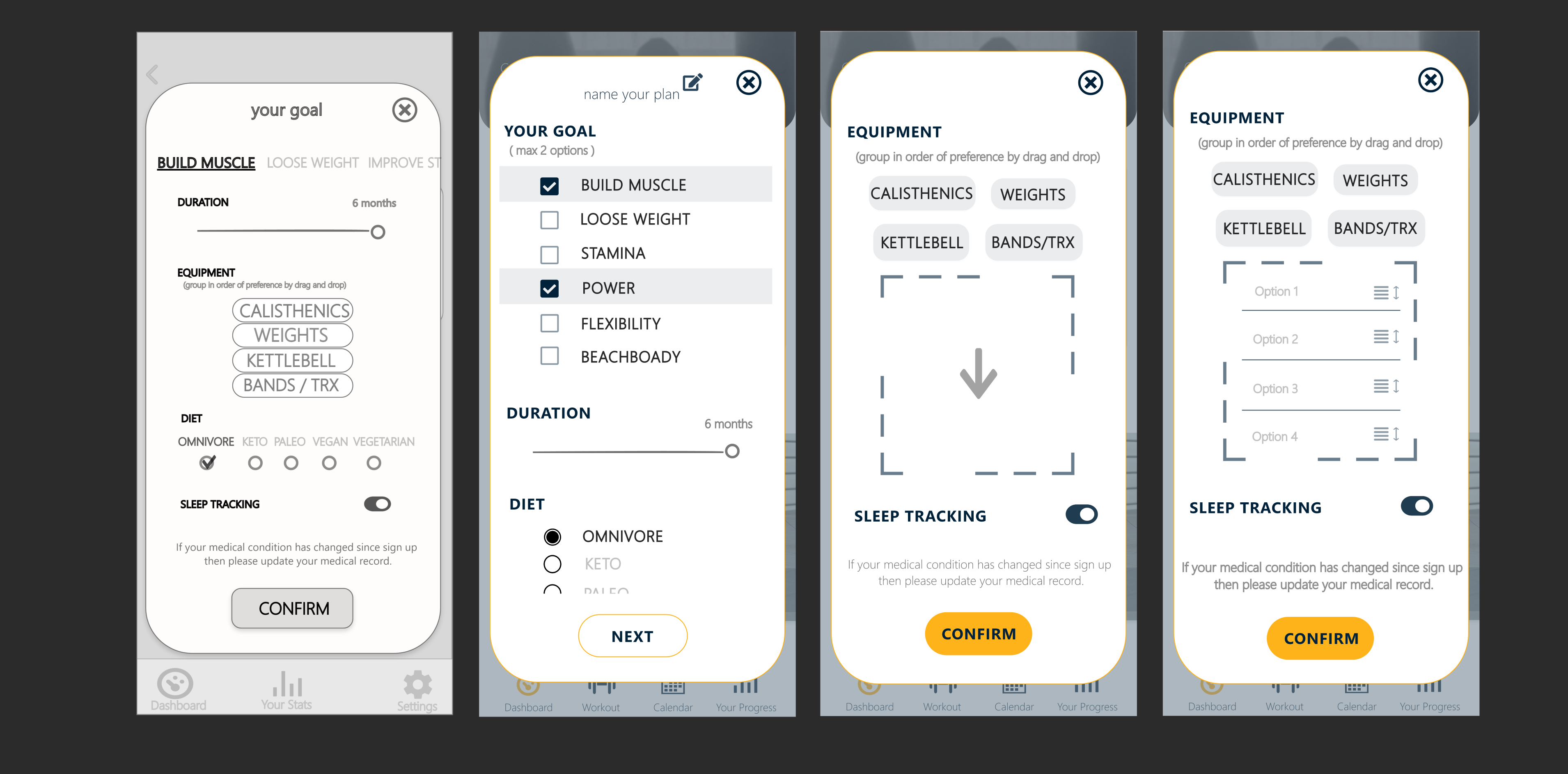
After user testing and several reitarations the drag and drop mode has been made more intuitive by using well known icons to indicate the function and also I’ve chosen to reduce cognitive load by dividing it into two pages for more space.
VISUAL DESIGN
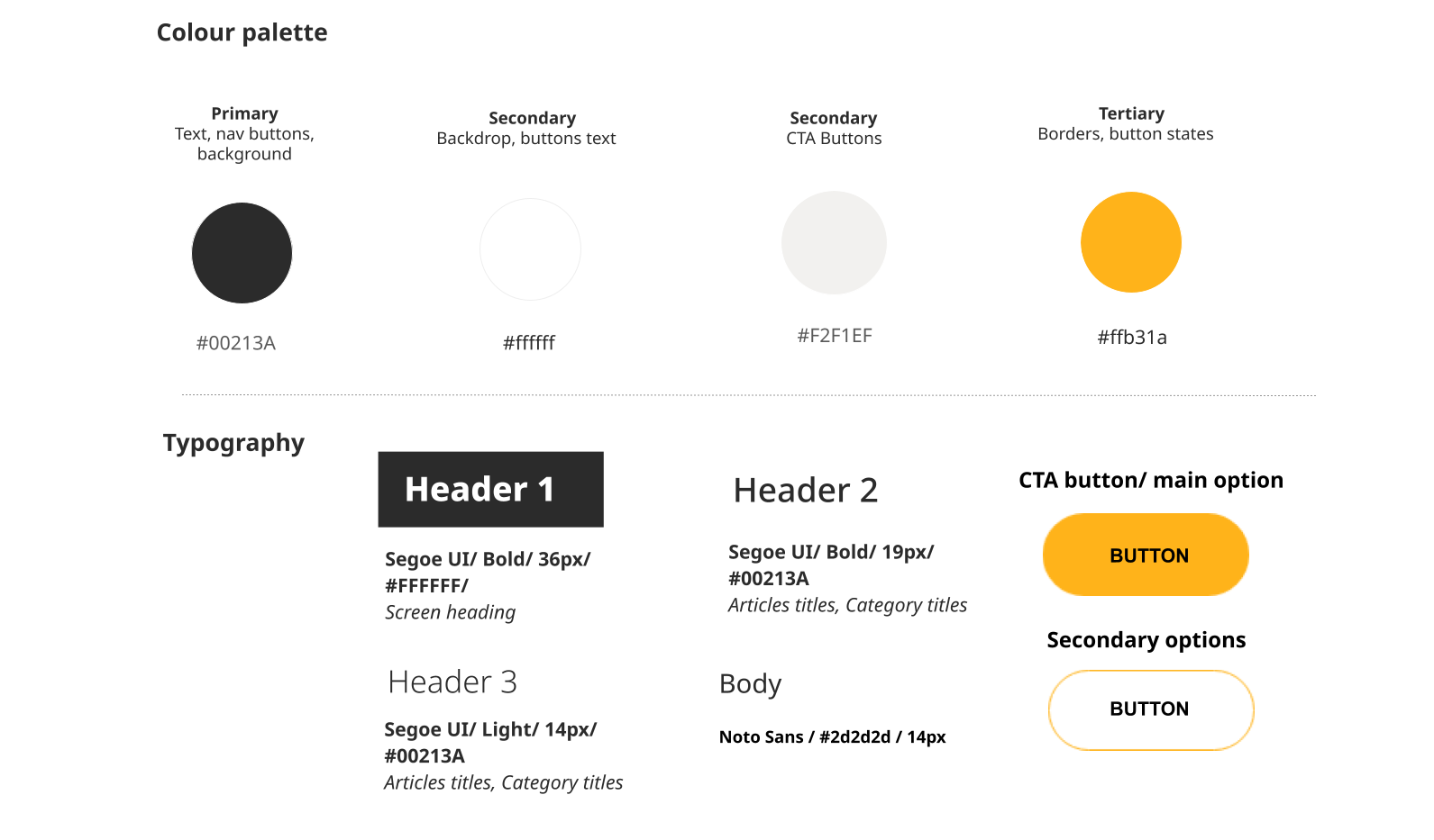
Component library
I’ve created a structured design system to maintain consistency on all screens.
A design language system makes it possible to ensure that the styling is cohesive and improves user experience.
CONCLUSION
Outcome
The initial hypothesis of a holistic approach to fitness encouraging users to do better has come up during the qualitative research where users expressed the desire to see improvement in all aspects of their lives. Subsequently, a second hypothesis could be raised: users will generally see greater improvements if they journal their results and thoughts. I tried to keep these ideas in the forefront when creating the app so that they can be tested later on.
Learnings
Going through each stage of the UXD process for my case study has taught me about the importance of having a user centred approach towards every project and keeping an open mind regarding the outcomes. I find usability testing to be the most important stage as it’s the best way to test a hypothesis and to discover frictions.
Whats's next?
I would like to further test the high fidelity version of FitZEN to further refine the navigation and certain features. Performing tests and analysis after the app is launched as a MVP can also be a great opportunity to learn about the target audience and their needs. In the future I would also like to tackle the issue of child obesity and develop a feature in FitZEN that would work together with parents and their children.